
Author: Linda Harnisch
– Communications Lead
Google has announced to push for a standardisation of app icons in the Google Play Store in order to improve the overall store experience. Is your app icon ready for this recent adjustment?
Drop us a line via email if you’re not sure and want to learn more – or any other ASO related matters in this case [email protected].
These new regulations to the Play Store do not come as a surprise. Google brings new updates to its app store pretty frequently. In the last months we saw darker design colors and an updated review design. The most recent change that we see now is the introduction of uniform app icons.
What is the current status of Play Store app icon design?
Right now any given Android app icon can basically have any desired shape as the app icon, if it uses a transparent background. Although the icons have to be 512 x 512 pixels in size, their appearance is often quite different. Even if they belong to one and the same brand.
In a first step Google now informs and prompts app developers to implement a new style for their app icons over the next months. The timeline published on the Google developer blog reveals that all changes should be implemented by 24 June.
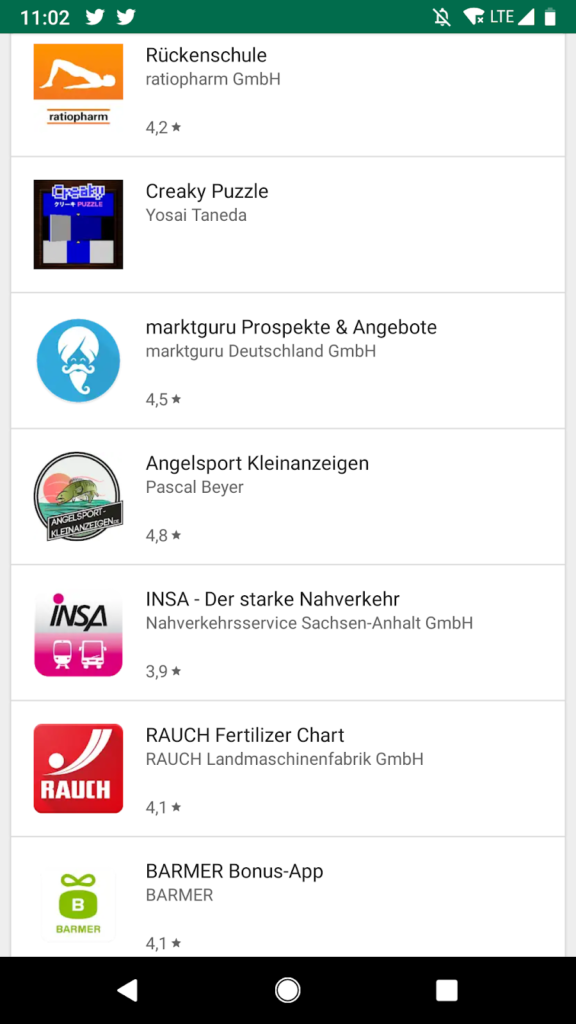
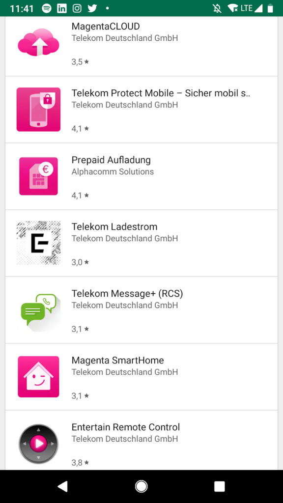
Source: Google Play Store
How will the new app icon design specifications look like?
On the developer blog Google states “these updates will help us all provide a more unified and consistent look and feel for Google Play”. How do app developers get there?

Left to right: original icon, new icon (example), original icon in legacy mode (Source: Google Developer blog)
The new app icon design from 24 June will be the design you see in the middle of the above picture. Icon specifications will remain at 512×512 pixel but transparent backgrounds as in the original icon on the left side will no longer be supported.
Starting in May any new icon uploaded in the Google Play Console must be meeting the new specifications. Google will dynamically apply rounded corners and drop shadows to icons. The corner radius will be 20% of the icon size, to ensure consistency at different sizes.
From 24 June onwards any original icons on the Play Store (see first icon on the left) will be converted to the “legacy mode” (see last icon on the right). Any new icons submitted must meet the new specifications (as before).
What is the deeper meaning of the new app icon specifications?
Google is taking a step further towards forcing developers to employ a more conform app icon design – If the mountain will not come to Muhammad, Muhammad must go to the mountain. Apple has implemented this already so Google is performing the logical next step and follows.
Brands publishing several apps will now be forced to take a hard look at their icon design for the sake of conformity. Which is actually not a bad idea but could help some brands to strive for more conformity in their brand presentation. For users nothing much is changing. Some users might recognise a more conform look and feel. They might perceive this change as a positive development to an increasing professionalism of the Google Play Store.


