Author: Steffen Meyer, Mobile Marketing Content Specialist
Looks matter, if you like it or not, and it is true for texts as well.
You may write the most intriguing description for your app but if it is a text wall with no visual formatting, you may lose potential customers before they even start reading.
So you should not only ponder about the right words but about the right use of Emojis and HTML, too. A cleverly set ✅or 🧮 paired with a headline in a certain color or in a bold or italic format may make your text more appealing.
It is quite easy and it pays off: The Boomerang app saw an increase in app page conversion by 16%, after having formatted its description with bold and underlined headlines. So it is wise to spend some time on the looks.
App Store is very strict, Playstore changed policies
But before you start dressing up, it is important to understand what’s allowed by the stores.
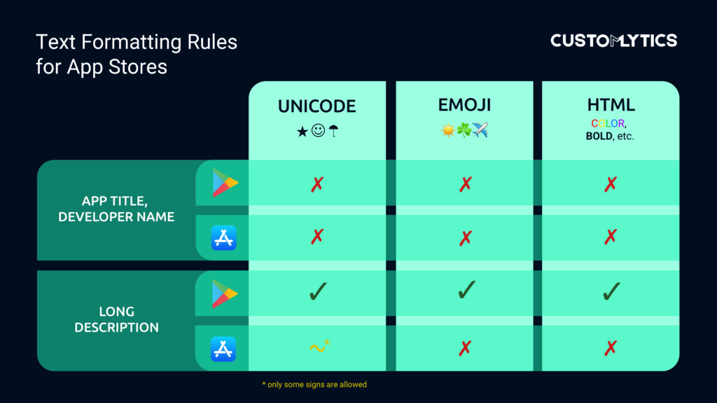
Apple is very restricted in the use of visual elements. Its App Store doesn’t allow HTML or any Emojis at all. Even many Unicode signs are banned. There are some tricks to get around it, for example you may use this √ – it looks like a check icon but is in fact a root symbol. But other than that, the possibilities are rather bland.
For a long time, Google’s Playstore was more lenient in this matter, though it changed its policies last year. It no longer allows developers to use Emojis in the Title or in the Developer name. The change was made, as Google puts it, to „drive meaningful downloads“, which is a nice description to combat misleading tactics.
However, in the long description section Google still allows the use of HTML and Emojis. Those users who read the long description are already highly engaged. So a well-designed text may result in conversions. Have a look at this cheat sheet to see what’s possible and what not:
How To Use HTML Formatting
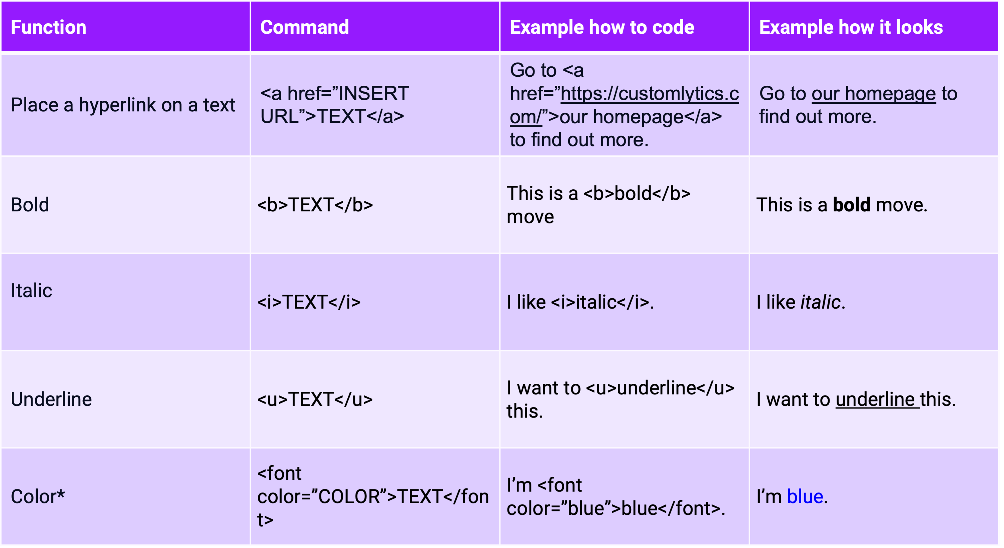
Don’t be afraid when hearing the word HTML, you don’t need to be a programmer to use it. It’s fairly simple. If you want to format certain words you always put these brackets <> in front of these words and enter the right command between them. When you want the formatting to stop, you use the command again but add a “/” to signal the stop.
If you don’t want to wrangle with this, you may always use an HTML Editor like this one and just copy-paste the code. When having lots of different formats, this helps to maintain an overall view. Here are some of the HTML commands you may use in the Playstore:
Emojis and Formatting – Do’s and Dont’s
Now that we got the technical stuff out of the way, here are some tips to make your description look more enticing.
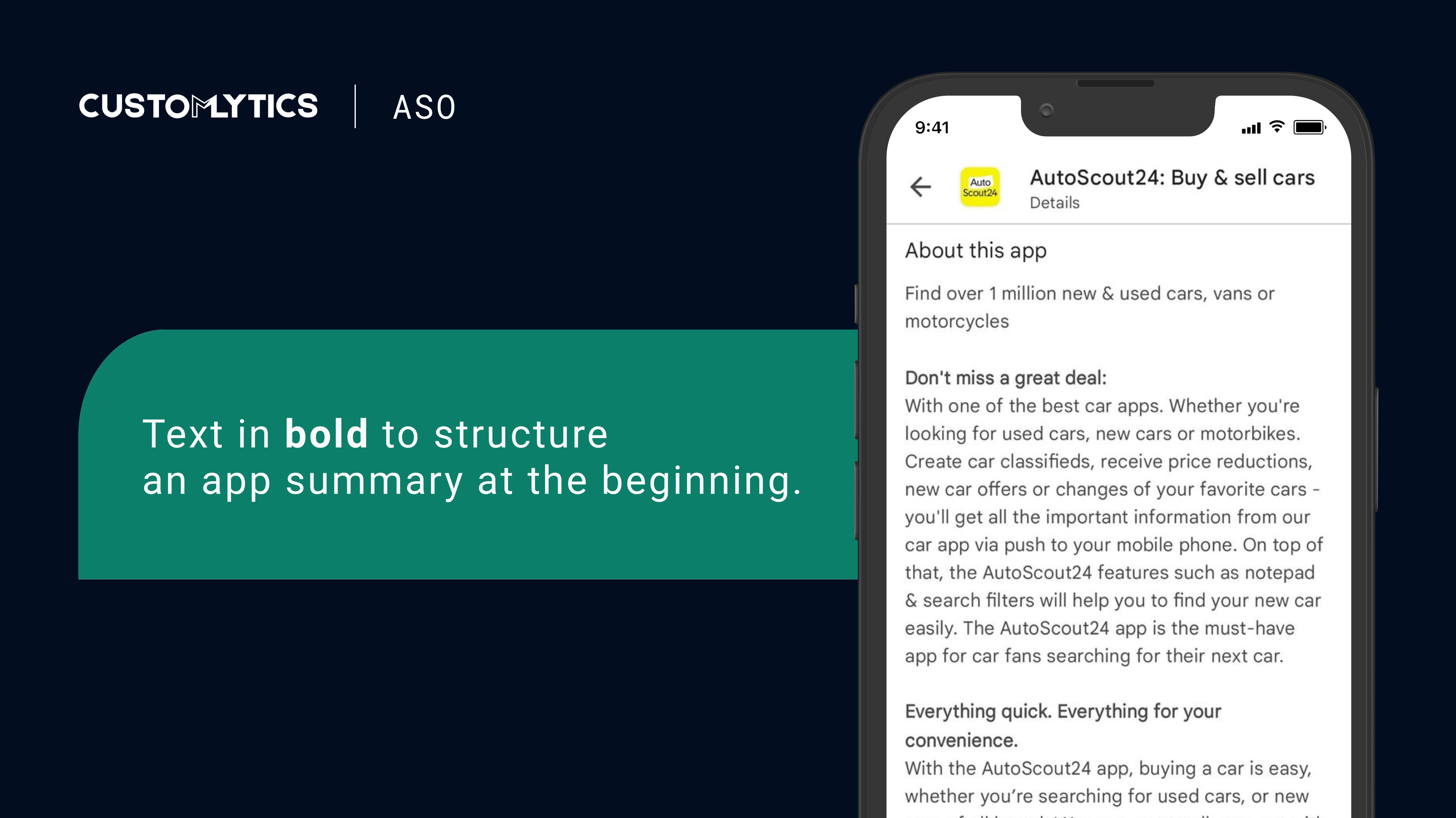
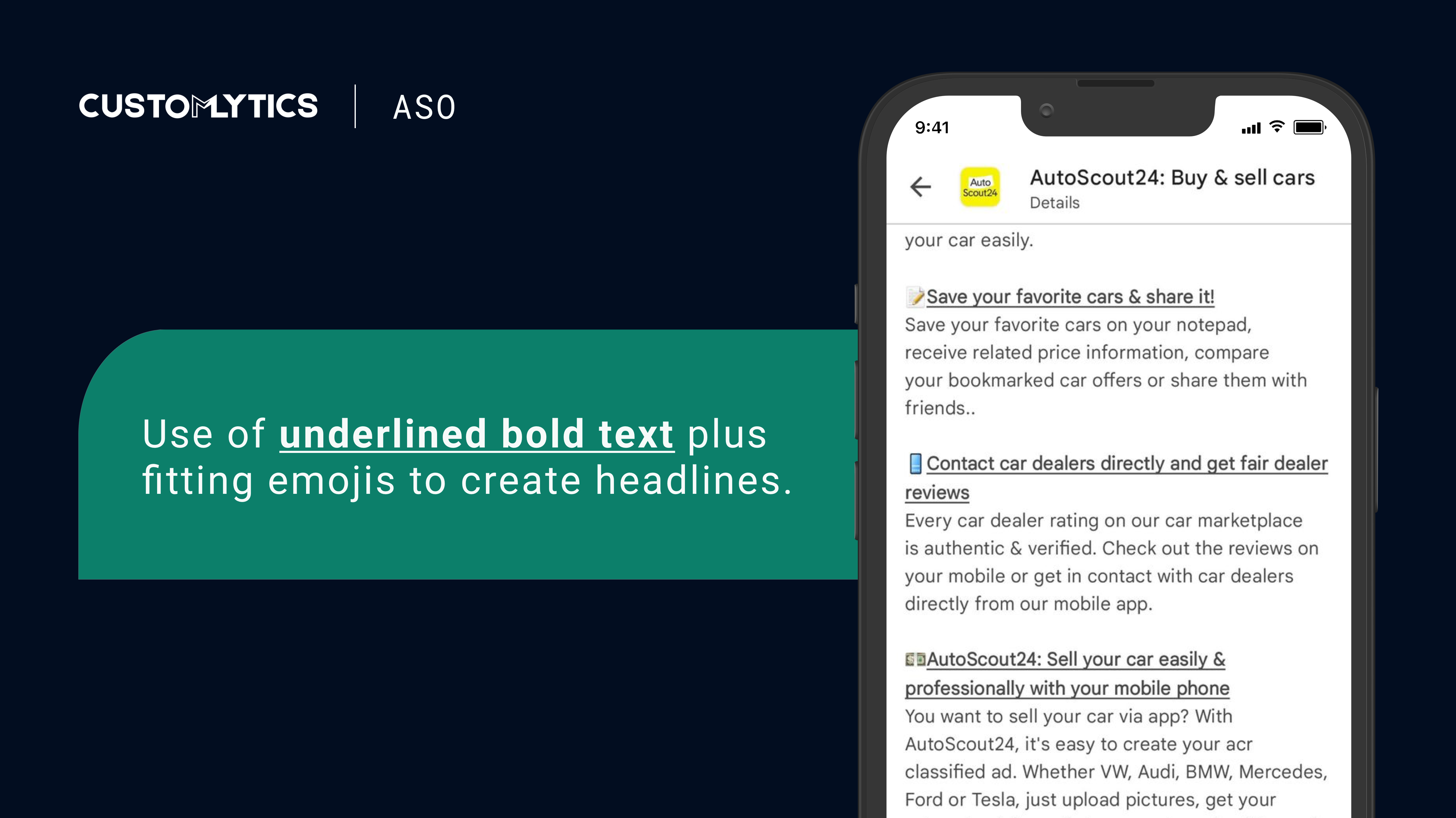
- Use the formats bold, underline and italic to structure your text, for example with a Headline Format. This way, the user may easily navigate from one section to another, skip the stuff he does not care about and discover topics he might have overlooked otherwise.
- Don’t overdo the highlighting of text in the long description, for example by formatting a whole paragraph in bold or italic or both at the same time. This often looks cheap. Instead, put emphasis on your app’s main message and highlight relevant keywords.
- When creating a list, use Unicode symbols like dots (•) or boxes (■), Emojis or whatever suits your brand (☼ or ♦ for example?) instead of going with the usual dash (-).
- Colors can be a very effective way to draw attention. For example, if you want users to read important information before downloading, consider adding some color to headlines or highlighted keywords. Stick with one color and use it sparsely, except it really suits your brand.
- Shy away from everyday emojis like 😂 or 👍. Have a look at https://emojipedia.org/ and find the ones which correspond with your brand – and if you do not find any, maybe Emojis are not the way for you to go.
- Previewing changes on the Google Play Console: you cannot review your formatting changes in Google Play until the updated app description is live. The folks from Boomerang app recommend using an A/B test and giving the formatted version as little traffic as possible. Then check on what it looks like live and adjust if needed.
Best Practices
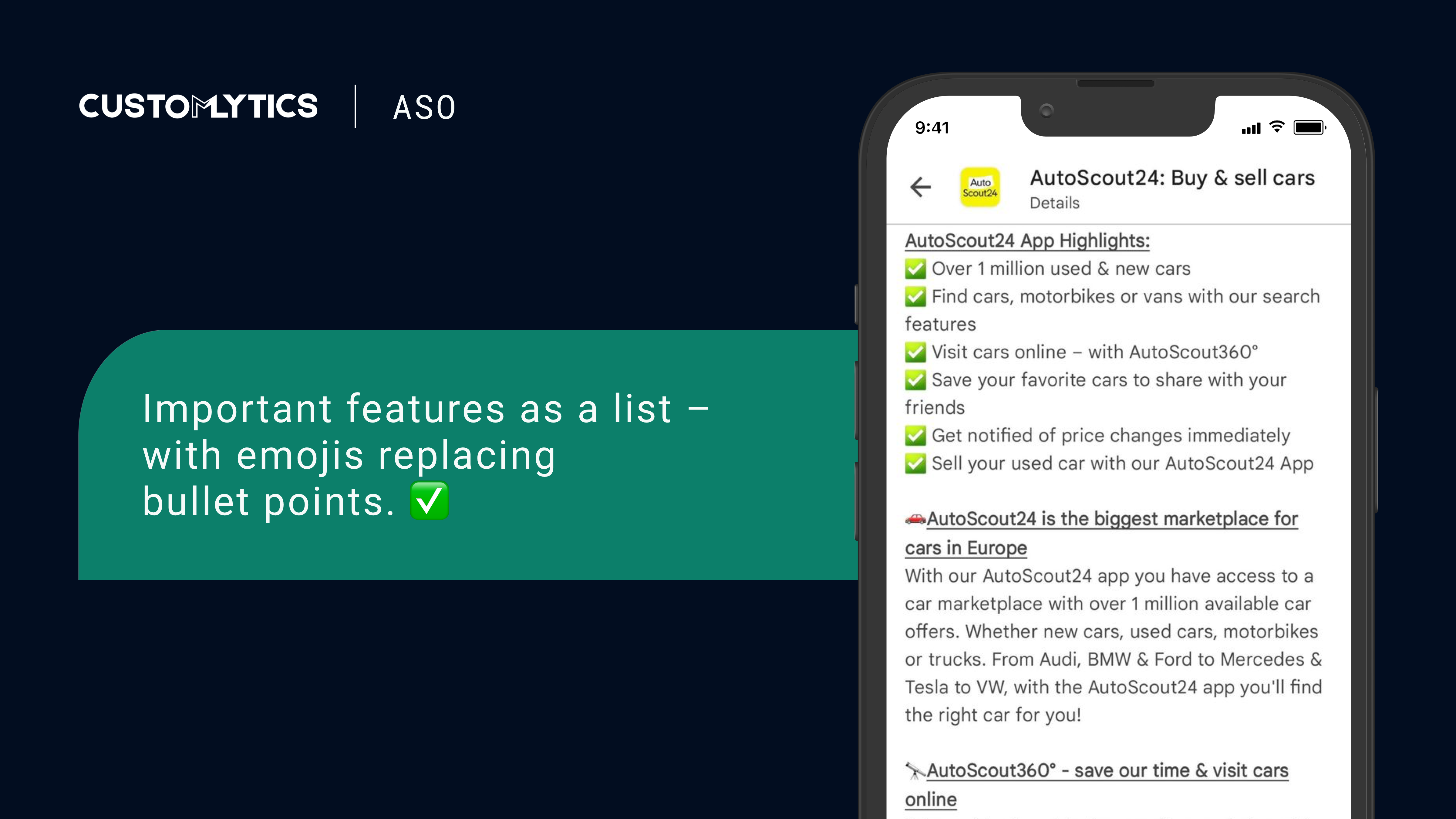
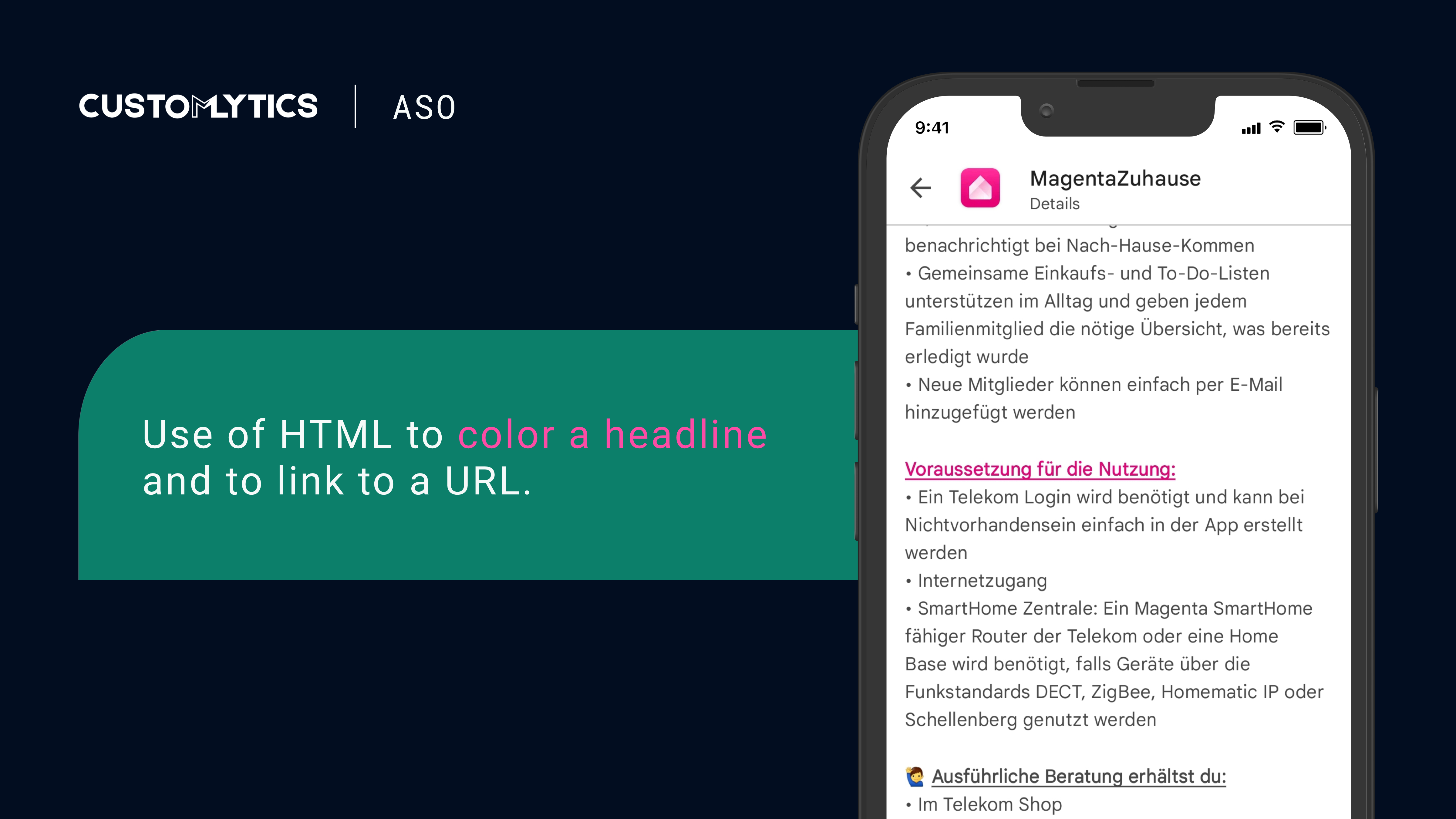
Using HTML and emojis isn’t complicated at all but very effective. If you like to delve deeper into how to step up your ASO game, download our free eBook on ASO in our Ebook section.
App Store Optimisation is an integral part to raise downloads of your app but ASO alone doesn’t make a marketing strategy. Have a look at our Marketing Master Map to see how it fits into a holistic plan that makes your business more successful. Also, feel free to contact us if you need support.
💡 Knowledge sharing is at the core of what we do. Learn more about the app industry and discover useful resources by signing up for our newsletter or become part of our community on LinkedIn, Twitter, Glassdoor or Instagram.
Helpful Links:
- Emojipedia
- HTML Online Editor
- The 5-Minute App Store Optimization: Rich Formatted Descriptions Increase Installs by 16% (Boomerang)
- Updated guidance to improve your app quality and discovery on Google Play (Google)


