7 seconds – that’s the average time users spend on an app store page before deciding if they download it or not. So it’s important to make a good first impression. The more visual appealing the app store page is, the more likely users will hit install.
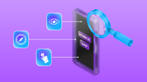
The most important parts are the icons and the screenshots.
You may as well incorporate videos but their effect is questionable: Some say they improve conversion rate, others say they are barely watched because users just download the app to have a look themselves. After all, downloading and trying the app takes around the same time as watching a video.
So if you got the ressources, you may produce a video, but keep in mind that it’s more a Nice-To-Have and in this blogpost, we focus on the Must-Haves.
Icons: Representing Your App’s Essence
The app icon is a visual ambassador for your app, making it a critical element in attracting users. In a crowded app store, an icon that stands out visually enhances the chances of being noticed and remembered. Here’s what to look out for:
- Clear and Simple: Design an icon that is clear, simple, and easy to recognize. Avoid clutter and intricate details that may become indistinguishable in smaller sizes.
- Use of Colors: Colors have the power to evoke specific emotions and can be leveraged to represent the nature of your app. For example, blue may convey trust and professionalism, while red can represent excitement or urgency. Green can signify health and nature, while yellow may evoke feelings of positivity and energy.
- A unique symbol: The chosen symbol should reflect the core functionality or purpose of your app. Whether it’s a camera for a photography app or a shopping cart for an e-commerce platform, users should intuitively understand what your app is about. Aim for a symbol that is memorable and unique. It should distinguish your app from competitors and create a lasting visual association in users’ minds.
Be mindful of cultural sensitivities and potential interpretations of symbols. Symbols can carry different meanings in various cultures, so choose one that is universally understood or at least culturally neutral. - Micro-Optimization: Ensure your icon looks good at various resolutions and sizes. Test its visibility on different devices to guarantee a consistent and appealing appearance. Apple’s app store allows you to upload variations of your icon to fit different resolutions and Google recommends some Do’s and Dont’s.
Screenshots: Mastering the Visual Encounter
Screenshots are often the first visual contact users have with your app’s user surface. They play a crucial role in shaping the initial impression and influencing the decision to download.
- Adhere to Design Guidelines: Each app store has specific guidelines for screenshots, with Apple being extremely specific on resolutions for different devices. Not so long ago, you had to create screenshots for each phone format. Now Apple became more flexible by automatically adjusting to certain formats.
Android on the other hand, just tells you to have a minimum dimension of 320px and a maximum dimension of 3840px, the maximum dimension can’t be twice as long as the minimum dimension. However, your screenshots should be at least 1080px – not only does this improve user experience but it will make possible that the images show up in special formats.
In the Google Play Store, large screens play a more important role. So it’s recommendable to include tablet screenshots in your ASO strategy.
For a closer look, here are the links to the Google Playstore and Apple’s App Store. Familiarize yourself with these guidelines to ensure your visuals meet the requirements for size, resolution, and format.
An important difference to note: While in both app stores, three screenshots are shown in the search preview, on the product page, Apple only allows up to 8, Google up to 10 screenshots.
- Branding and visual continuity: Use consistent branding elements across your screenshots and ensure visual continuity with your icon. This includes colors, fonts, and logos. A cohesive visual identity helps in brand recognition.
- User Journey Narrative: Arrange screenshots in a logical sequence, telling a story of the user journey. Start with an engaging introduction, showcase core features, and conclude with a compelling call-to-action.
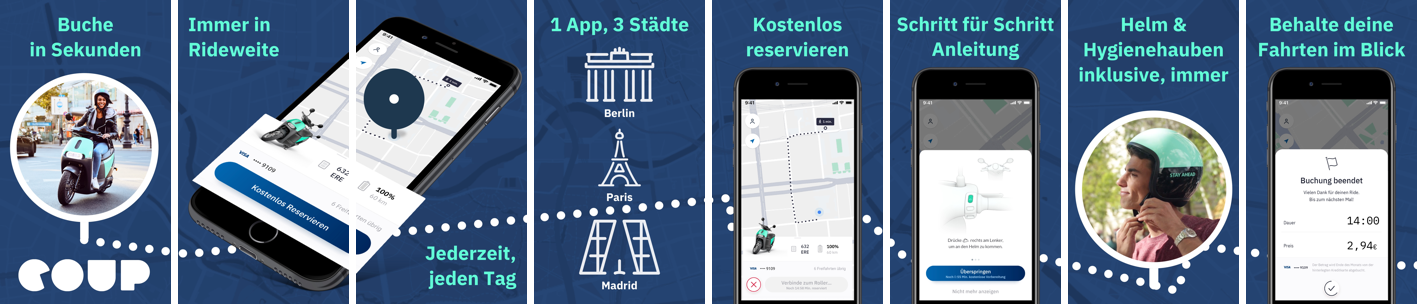
- Label and Annotate: Clearly label and annotate important features in your screenshots. Use concise text or graphical elements to guide users through the functionalities of your app.
- Reviews and Ratings: If your app has impressive ratings or positive reviews, consider incorporating snippets of these as overlays on your screenshots. This can build trust and credibility.

Continuous Improvement with A/B Testing
App Store Optimization never stops which is why you should run A/B-Tests with different icon and screenshot variations to see which are performing best. Test elements like colors, captions, and feature placement to understand what resonates best with your target audience. In Apple’s app store, use Custom Product Pages, in the Google Playstore, it’s the Store listing experiments feature.
Additionally, you may customize your visual elements to align with seasonal events like Halloween, and you should have a look at our Marketing Master Map to ensure continuity of your brand visuals across the whole marketing funnel.
💡 Knowledge sharing is at the core of what we do. Sign up for our newsletter and become part of our community on LinkedIn to learn how to make apps succeed in the competitive mobile landscape.
Helpful Links: