Authors:
Adam Napoli
– Senior Graphic Designer
Isabella Zulli
– Former Design Lead at Customlytics
In our new blog series The UI/UX Makeover, we select popular mobile apps bearing the potential to provide their users with a better experience. A micro-makeover within 8 working hours for applications from all sorts of verticals. Today Customlytic’s graphic design experts challenge the Lidl Plus app and will apply a micro facelift to the app’s UI/UX design.
The Situation
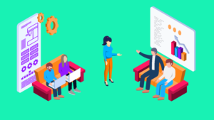
As society progresses into the digital age, so must businesses and brands as they aim to be the market leader in their respective industries. Over the last few years, the majority of supermarket chains have developed mobile apps to grow and retain their customer base through the use of online shopping, rewards programs and discounts amongst other things.
Founded in Germany, 1930, Lidl is a German global discount supermarket chain that operates over 10,00 stores across Europe and the US. In 2019 they introduced a new loyalty program, Lidl Plus. The app is essentially a digital customer card in the form of a smartphone app, and records the shopping behavior of customers and accordingly provides the user with discounts and coupons.
Lidl offers 2 apps to its customers. The first being the Lidl app which can be used by users to shop on mobile devices. The focus of our blog however is the Lidl Plus app, an app that eliminates the need for a physical plastic customer card. The app provides a digital customer card for loyal Lidl shoppers in Germany with all advantages and exclusive offers in one app.
Topic Focus – App Registration
Some mobile apps require a user to sign up and provide their data to gain access to the content inside an app. For users, filling out signup forms is painful enough on websites. This frustration is heightened even more so on mobile due to the small format of the screen.
So, what are some other reasons people find registration processes so frustrating? Well, few people enjoy filling out forms, inventing new passwords and having to validate emails and phone numbers. Forms are also time consuming for users and can ask the user to provide data they are unwilling to share.
A poorly designed registration experience can cause problems with page exit rates and low conversions. Many users may drop out of the app at this point if they don’t see the value in signing up, or if the process seems too complicated and time consuming. Remember, this is the first experience a user has in your app, so a good UX at this stage is crucial for setting the overall user experience. A smooth and simple registration process will increase conversion and decrease abandonment.
Best Practice – App Registration UX
Here are our top tips for designing a successful registration process:
- Define the value proposition (CTA)
Have a crisp and sharp message (one sentence) above the form that states what value/benefits the user gets from filling out the registration form. Use this text to motivate the user and make it sound desirable for them to register. Provide them with the “why” – why they need to sign up and what they get in return.
- Low Barrier Registration
Minimize the number of data fields you require from users (2-3 fields max). The fewer fields required, the quicker the user can get to using the functions of the app. The quicker you get the user to the other side, the higher chances you have of retaining that user. In an example of how reducing the number of data fields can boost your results, see how Expedia gained $12m profit in one year by removing one simple data field from their site.
Ask for information progressively, not collectively. If you need more data from the user, you can ask for this information after the registration process. Only prompt the user to provide certain data when necessary and at a time where they can understand the relevance of providing the data.
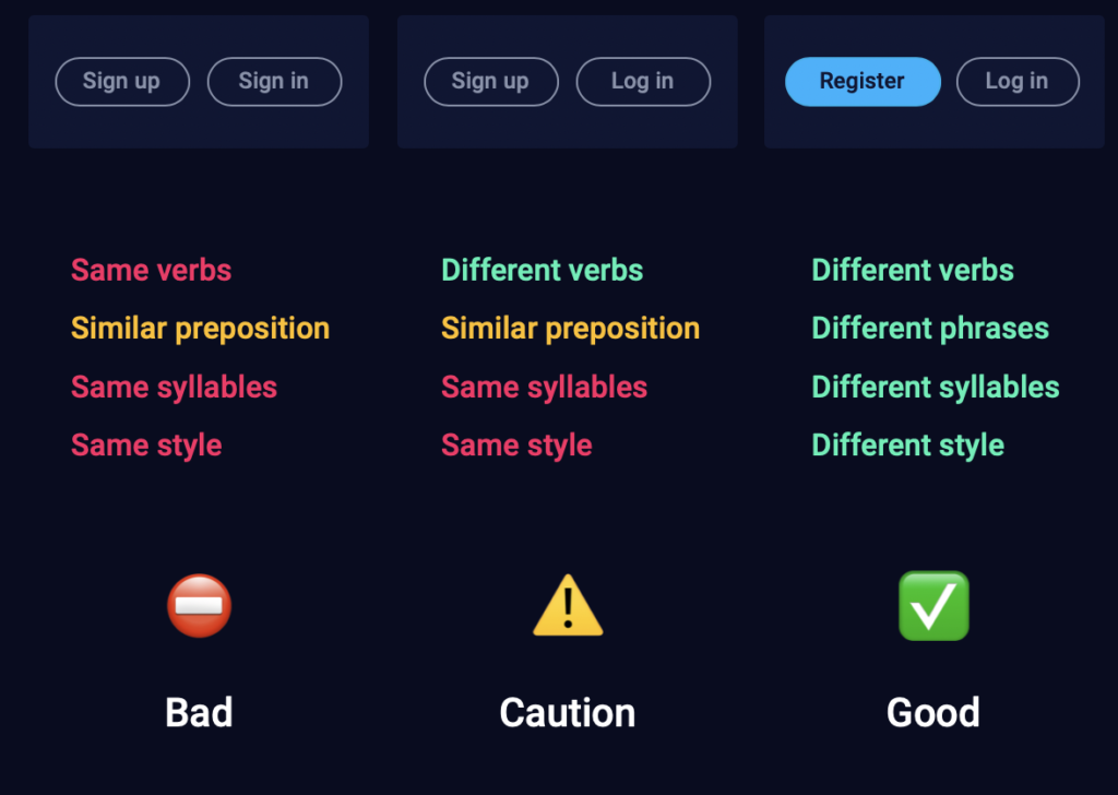
- Differentiate Sign in and Sign up
Avoid creating uncertainty or confusion for the user by displaying the two options differently. You can do this by providing visual differences in the button styles, clearly defined headers as well as the description of the action.
- Offer alternative login options – one-click registration
Social logins allow users to easily log in to your app with an existing social account – Facebook, Google, etc. This is attractive to users as it eliminates the need to remember another password and also speeds up the registration process.
- Eliminate distractions
When the registration page opens, the menu and navigation should disappear. Keep it easy for the user to understand that all they need to do here is input their data. Include a login option for returning users.
- Single Column Data Field Layout
Users should seamlessly read and enter information from top to bottom, not left to right to top to bottom. By designing the registration form in a single column layout, you are saving the user time.
Current Registration Process for Lidl Plus
We found the pain point…
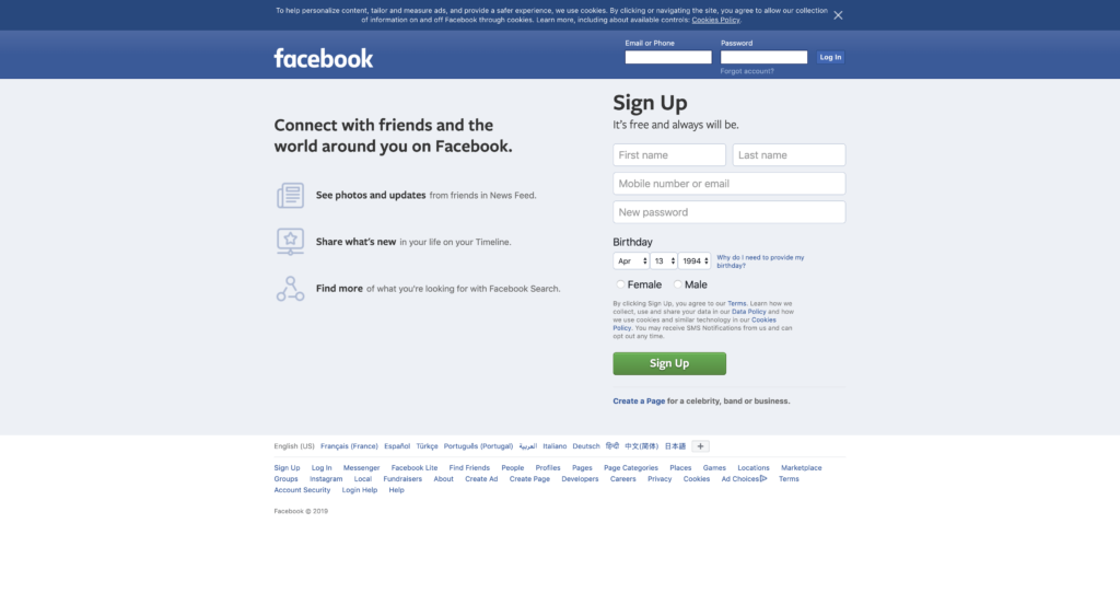
Before you can use this app, Lidl Plus requires you to a complete and lengthy registration process to ensure they have accurate data (12 pages of registration to be exact!). Whilst important for the app and the personalized shopping experience, the customer journey to simply register is laborious, needing numerous clicks and steps to register all details.
According to UX Planet, ‘Even though registration is so common a thing, it’s also one of the trickiest parts to design. Make sure that your sign up page isn’t an obstacle to your users by following these tips for designing a better registration process.’
Looking at other popular sites and how they design their registration process, we see some patterns starting to form. Most simplify the process and require from you:
1. Name
2. Email
3. Password
4. Date Of Birth
5. Country
The Problem
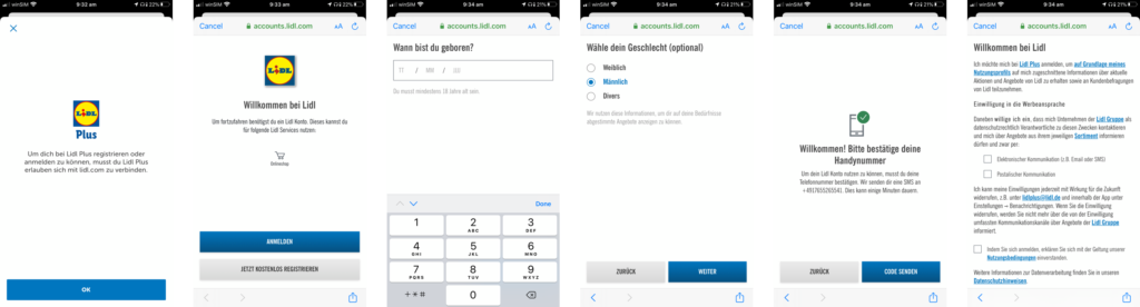
Before the user is even able to register with personal details, they are guided through a lengthy process that involves reading about all the benefits, selecting a region, and choosing a local store (see visual overview below).
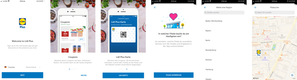
After this, the user is then asked to register their account. This involves the standard sign up requirements (name, email address, DOB) but is also followed by entering a phone number and requiring verification from an SMS, and selecting a gender. While this collection of data is important for Lidl Plus to customize and personalize a user’s experience, each of these steps is presented on a separate screen, requiring over a dozen clicks to reach the final step. In our testing, this entire process took 5 minutes.
The Solution
How can we improve the user experience?
Our main goal for Lidl – aim for speed and efficiency. We want to let the user into the app as quickly and pain-free as possible. We have designed a registration screen that allows the user to register or login without any need to input additional personal data. See our screens below:
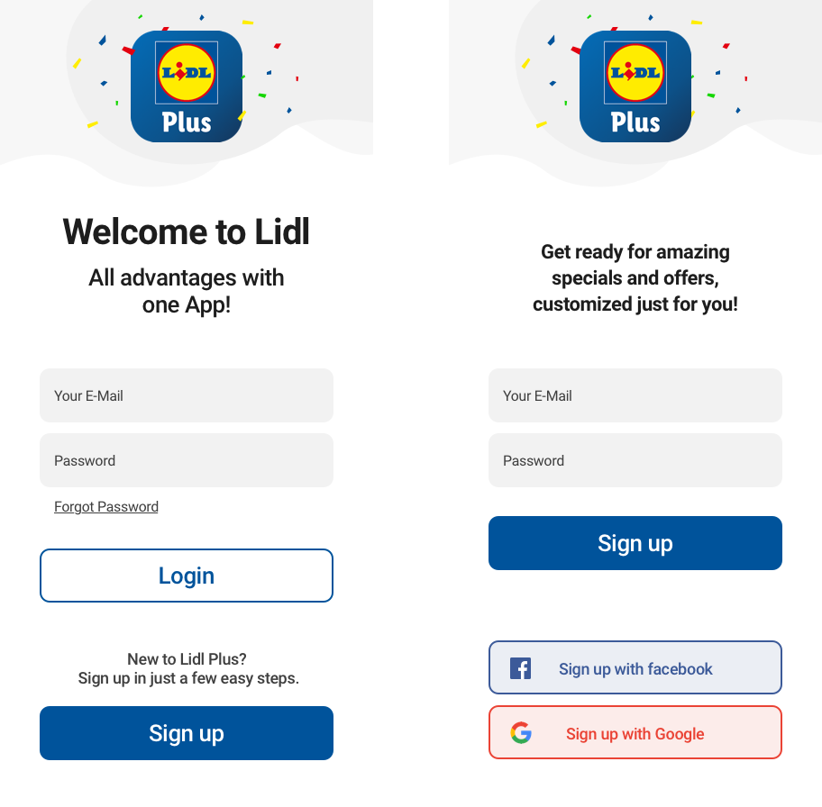
The data collection process is important for Lidl to make sure they target their users with the right offers and promotions, so we want to break down this process and allow the user to update their information as they browse the app. We’ve added social buttons for an even quicker registration process if the user is already logged in to something like Facebook or Google. The registration process is done, so we are securing them as a user of the app with the basic login details.
We’ve highlighted an important component of Lidl Plus’ data collection aspects to personalize and improve the user experience, which is the store selection process. In the Coupons section, customers are able to redeem offers and deals which are loaded onto their digital card to be used in-store. Here is a before and after of the Coupons section after our UX transformation:
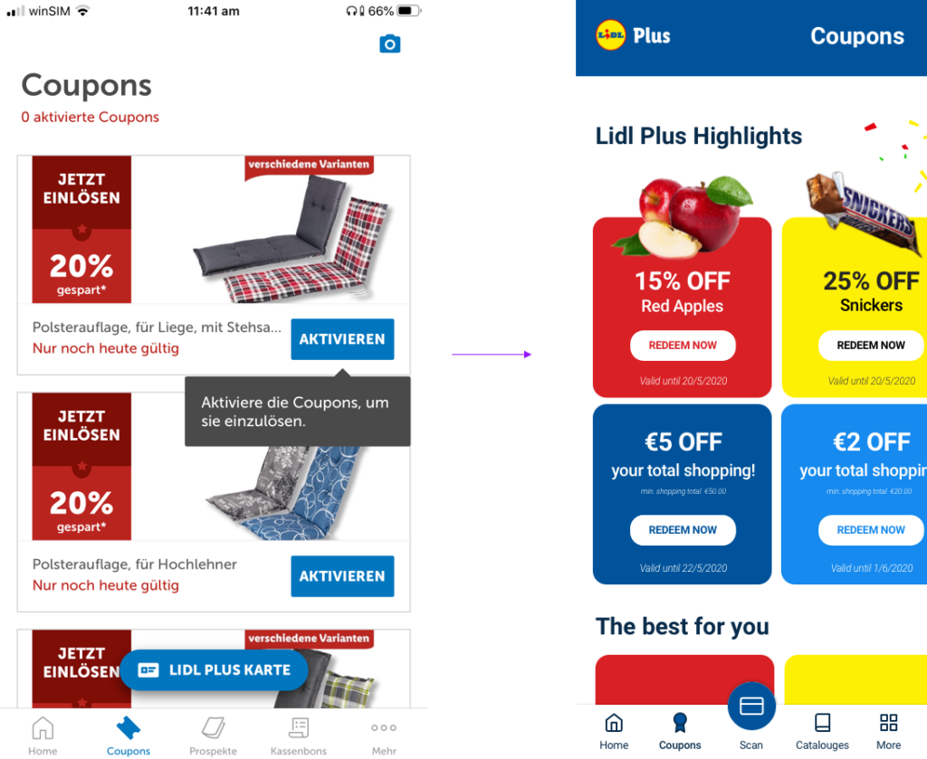
We’ve given the app an aesthetically pleasing design overhaul to make the promos clearer and stand out more and to match our re-worked registration screens. We’ve also moved the scrolling digital card button to be a permanent fixture on the bottom navigation to signify its importance. From this screen, a prompt will pop-up asking the user to enter their postcode and to select their local Lidl store. See below:
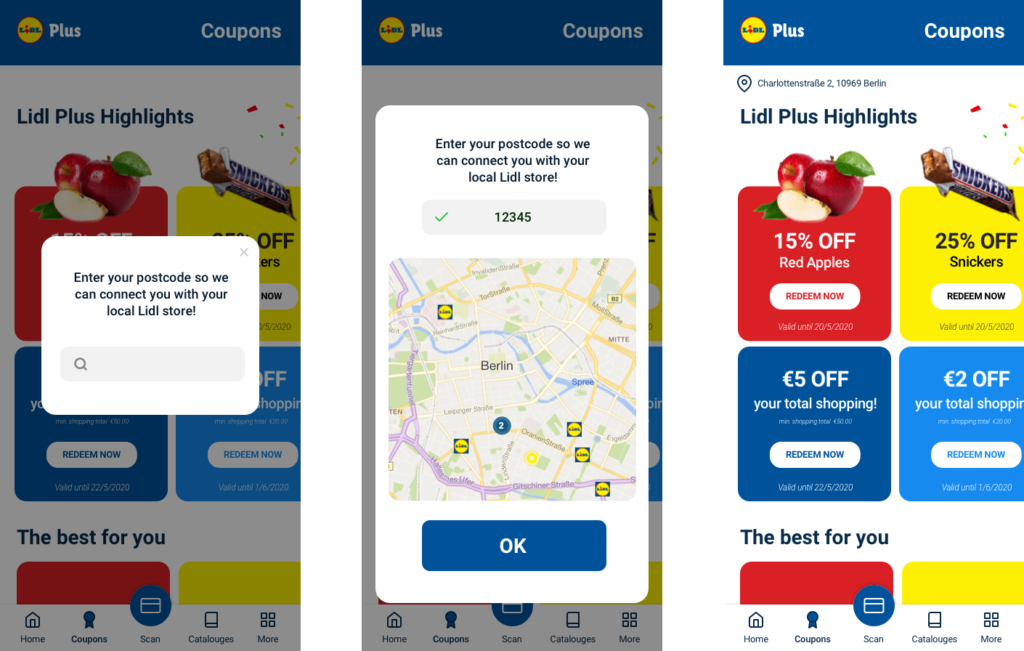
The user journey to entering their location into the app begins with a pop-up prompt upon entering the Coupons screen. It asks the user to enter their postcode to connect with their local Lidl store. After entering the postcode, the user is then shown a map screen with various Lidl icons representing the closest stores in proximity to the postcode entered. The user simply clicks which store they would like to connect with, and presses the OK button.
On the follow-up screen we can see a location icon with a store address. By changing the way the data is collected, we are not overwhelming the user at the entry point of the app. This step by step process would then be used on other sections of the app to collect more information whenever it is most relevant. An example of this would be to redeem an alcohol offer, which would then require the user to enter a date of birth. These kinds of examples make it clear to the user why the data is needed.
The Result
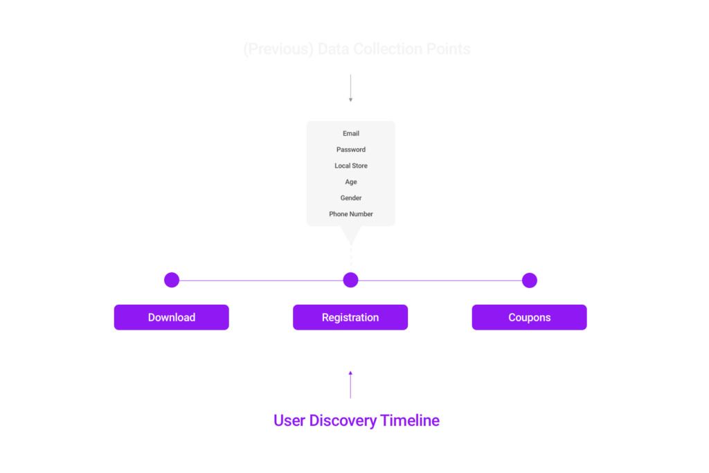
We’ve used several best practice tips mentioned earlier to create the new registration flow for the Lidl Plus app. The value is clear from the start and users can download and register with minimal fuss. We have offered alternative login options and eliminated other distractions that are currently present in the Lidl Plus app. Here is the current user discovery journey:
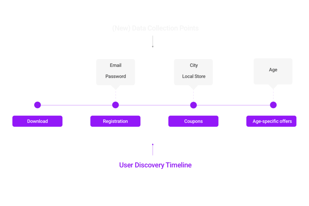
After our research and initial designs, here is the new version of the user discovery timeline:
Simplifying the registration process is more than just changing the aesthetic elements of an app. It involves breaking down each individual detail and recognising its value so the user feels more comfortable allowing their data to be collected as long as the reason why is clear.
Looking for UX/UI mobile app advice? Our experts at Customlytics are ready to help you optimize your app to maximize its growth and potential. Get in touch with us at [email protected] and let’s get to work!
Just like any other guide, tips specified are just a place to get started. Make sure to match them with your own ideas for the best results.