Author: Bastian Klenow
– Former Graphics & UI/UX Designer at Customlytics
“You cannot understand good design if you do not understand people; design is made for people.” – Dieter Rams
There is a fine line between good and bad eye candy and balancing usability with emotional delight. Especially when you keep in mind that one in five users will never launch an app again after one session. So, be brave and venture beyond a user interface that’s just overflowing with aesthetic fanciness.
Our graphic design team here at Customlytics accepts that challenge every day. And we will share with you a sneak peek of how to aim for the perfect balance between having a clean UI for mobile apps while displaying valuable information to the user.
In our new blog series The UI/UX Makeover, we select popular German mobile apps bearing the potential to provide their users with a better experience. A micro-makeover of one mobile OS within 8 working hours for applications from all sorts of verticals. Let’s get started and if you want us to tackle the design of a specific mobile app, reach out to us.
The Situation
For our first micro UI/UX makeover we are taking a closer look at an app that provides mobile booking services: the HRS app (on iOS). However last-minute your next vacation or business trip is, you want a travel app that makes things easier when searching for accommodation in a certain location. HRS is a platform that helps users to find a hotel from a large pool of accommodation providers.
The current hotel search process of the HRS mobile app on iOS is comprised of four steps and for our UX/UI design makeover, we focus on steps 1-3. It is not necessary to reinvent the booking process (step 4). There are already very good technical solutions supporting this feature. And besides, this is not the key feature of the HRS mobile app.
- Setup your preferences on the home screen (e.g. calendar, location)
- Discover what accommodation options are available (list and map view)
- Detailed information about the available options
- Book your selection
Although the click flow of the HRS app for iOS is well structured as it regards to step 1) and step 3), we found a few pain points that can be improved. If the app wants to keep holding its user’s attention and finish bookings.
We found the pain point…The second step, the discovery of hotel options and the decision-making process, adds too much complexity. I
In an ideal case, the user immediately books an offer upon clicking on it. In reality, the decision-making process of a user precedes comparing offers and choosing what suits them best. Any mobile booking app such as HRS has to simplify this process. To keep the user’s attention and facilitate a state of flow travel apps have to give users some guidance in a surplus of offers.
The Problem
Technology should simplify our lives, shouldn’t it? It solves complex math problems for us or takes care of our time management. Yet, the capacities of human memory are limited. With the increase in choice and surplus of offers (e.g. hotels in a booking app), the determination of the decision becomes more difficult (Hicks law). Also, we can only process limited information at the same time (Miller’s Law).
Yet, in the HRS app, the user is left to deal with complexity due to information overload. The longer a user spends in the mobile app the more hotels they will look at quickly losing track of the information they have already seen. They will forget about the previously viewed hotels as soon as they leave the detailed information page. Emotion plays a big role here. If the user has a frustrating experience they have a hard time using the application and leaving it instead.
Finally, both the list view and the map view with hotel search results can add more value. The solution we came up with can easily be incorporated into the app’s list view. Incorporation into the map view will be more challenging since we are working with a rather small area in order to display information. Let’s take a closer look at the map view and investigate further.
Furthermore, we also see room to improve the overall business model of the app that could significantly benefit HRS. And we tell you how further down in this article.
The Solution
The solution we have designed for the HRS app adds not only value to the user experience but also the company as such. Think increased sales/revenue for a product that users want to use and deem useful in terms of look and feel, and value.
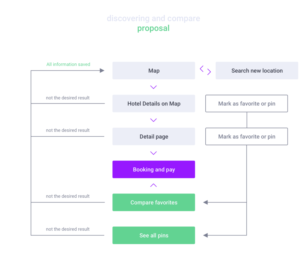
As previously mentioned, all information the user has seen is lost as soon as they leave a detailed information page they have just viewed. The user must also always go back to the home screen to start a new search. This calls for an approach of restructuring the click flow and adding new features


In the current map view, you will notice a bunch of generic red circles. All the hotels and further information about them, are hidden behind these:

So, how do you minimize friction and confusion users have when looking for the right hotel?
Here are three UI/UX design tweaks in the HRS app:
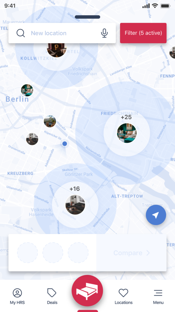
1. Show the user a thumbnail image of the hotel, instead of a red dot. People respond to and remember pictures more easily than just a position on the map.
2. Mark hotels the user has already looked at automatically. Users can see at a glance which hotels they have and haven’t looked at yet. When the user leaves and opens the app again, they can quickly find the hotels they have already searched for.


3. Allow the user to make a preselection. Minimize options in order to aid decision making. In the app, this shows as a new feature with the possibility to mark favorites. Once the user has finished exploring the map view, they will be able to see an overview of the hotels they selected. By reducing the amount of information users are able to make an easy, yet well-informed decision.

As a bonus, how about placing promoted hotels on the map view and increasing the profitability of the app? To benefit the business side of HRS, there is a possibility in the list view to highlight promoted hotels or to move them to the top of the list. So far, this is not the case on the map. Now in the new overview view, clustered groups can show promoted hotels at the top. It is only when you zoom in, that the other hotels will show.
The Result
By tackling this micro-makeover for the HRS mobile app, we want to give you an insight and some knowledge about the benefits of a UI/UX upgrade that provides users with a continuous flow of valuable information.
Making even minor changes to your app makes such a big difference to the user experience. It will help app companies to increase their customer base and also keep existing users satisfied, happy and retained.
In this article, we focused on what we believe is the most important and used feature in the HRS mobile app. As you can see, some changes to an app’s interface and enhanced usability are not even that tough. Take the switch from red circles to thumbnails in the map view: this can be achieved easily as the data for these images is already available.
Just like with any other guide, tips specified are just a place to get started. Make sure to match them with your own ideas for the best results. Our UX / UI design experts at Customlytics are happy to support you in any way to audit and advice on your mobile UI/UX design.
If you want to know more about our work check out our ASO case study together with COUP or drop us a note at [email protected].


