
Author: Bastian Klenow
– Former Graphics & UX Designer at Customlytics
“Recognizing the need is the primary condition for design.” –Charles Eames
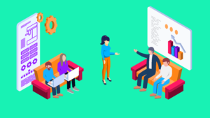
In our new blog series The UI/UX Makeover, we select popular mobile apps bearing the potential to provide their users with a better experience. A micro-makeover within 8 working hours for applications from all sorts of verticals. Today Customlytic’s graphic design experts challenge the Meetup social-media app and will apply a micro facelift to the app’s UI/UX design.
The Situation
In our new makeover, we took a closer look at Meetup, a social media platform that supports people creating groups in their own region or finding other people with the same interest. Founded in 2002, the company has grown to 35 million (2017) users in its almost 13-year history.
With its 225,000 groups in 180 countries, Meetup is one of the largest providers of self-organized local events. Various groups of different topics and sizes from around 15 up to 18,000+ members illustrate this diversity.
We here at Customlytics have our own meetup group, the Berlin Mobile Marketing & Growth Meetup. We are happy to organize our own events with the app and are also very satisfied. Nevertheless, there are some points that can be improved. For further analysis, we concentrated on the user side because this represents the majority of the app users.
We found the pain points…
Our review analysis indicates that many users have major problems with the registration process. For our makeover, we cannot dive deep enough for such a situation to generate solutions here. Nevertheless, there were a few insights into what still caused user difficulties, such as no screen optimization for tablets or the setting options for searching for events in other cities.
Further problems emerged after a closer examination of the app.
Inconsistent design
In the last three years alone, the app has received 43 updates, a little more than one per month. Without a decent design system, such improvements are lost over time in various smaller projects and the app becomes inconsistent.
Many products that have been on the market for a long time experience this fate. Individual features are added, others improved and some remain as they are. In the end, a patchwork app is created that also causes usability difficulties.
Insufficient filter function
As mentioned above, Meetup users are very diverse, much like their weekly and/or monthly plans. The app does offer filter functions, but these are limited and do not allow any individual adjustments. Other apps include functions such as “to-do lists” or “calendar planners” that provide improved event organization.
Blurry structure
The structure of the interface fails to help users identify focal points of the app. For example, a feature that only shows whether someone has commented on something or reminders for events in another place would be better located somewhere else and not the home page. This space could and should be better used by placing the two main functions “event planning” and “new discovery” here. The profile settings can only be reached from the home screen and is difficult to see at the top. There is also no clear distinction between individual features.
The home-screen is not differentiated enough as some elements belong to a profile feature, such as “own groups”. Furthermore, suggested events can be displayed in the event planning on the home screen, which overlaps with the discovery screen.
From this perspective, there is a lot to do for us.
The Problem
After analyzing the entire structure, we came to the following idealized user flow:

For users the two main objectives are clearly evident: attend events and find new groups. The calendar and the discovery feature reflect these areas in the app. We decided to examine these two areas more closely. Above all, we tried to update the unappealing visual interface with the redesign as well.
The current calendar function only allows a list view. For a general overview over a given time, lists are rather counterproductive because the events are always only displayed chronologically and thus events that are far apart in time cannot be experienced at the same time.
The current planning flow also only allows the distinction between: “all events”, “participating”, “saved” or “past events”. With the filter function, it is not possible to recognize whether two events from different categories (e.g. saved and participating events) may overlap.
The discover page lacks updated events and suggestions if you’re looking for something new. Users are often faced with the same event/group suggestions based on their interests, wasting the app’s potential to promote certain events or groups and make browsing more exciting.
When using the search option, the event location and time are not directly related, which can lead to confusion for the user who is used to these elements being directly linked. In addition, two search fields are duplicated which can easily be integrated into a single search field.
The Solution
Branding
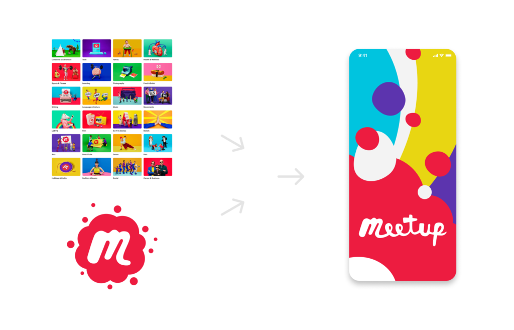
Let’s start with the visual redesign. The Meetup user groups are very diverse, which is already reflected in the current branding. Whether it’s the logo or the colorful categories of illustrations, Meetup presents itself as a diverse platform. Unfortunately, this identity concept is not evident everywhere.
Our new branding combines the vibrant colors from the illustrations and the logo and develops a key visual that appears in the entire product-environment. Together with the new branding, we propose a uniform design system that can display all UI elements in the same way on all devices and formats. Future improvements to the app should then always be considered within this design system to prevent the risk of a patchwork app being created.
Restructure
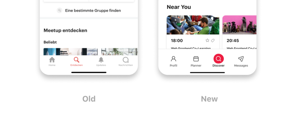
In order for the app to become easier to use, the individual features must be separated more strictly. The user must immediately know what features can achieve which goals. So, we changed the structure first and removed the update function from the bottom navigation which can now be found in the profile section.
In this case, we moved the profile feature from the hidden location and brought it prominently into the bottom navigation. Finally, the two main features are now centrally and easily distinguishable, located in the middle. (see below)
Now let’s see how these two main features work.
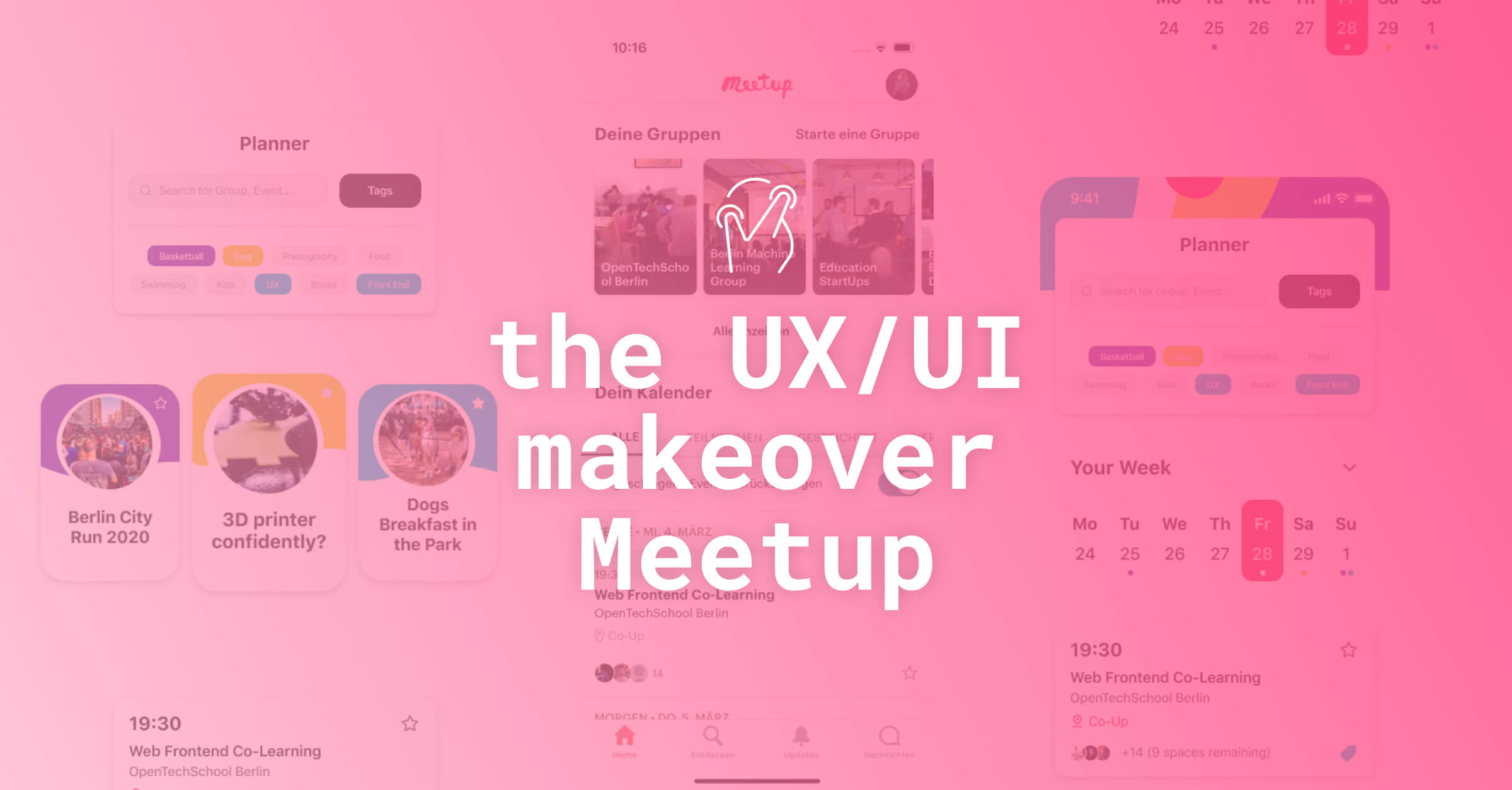
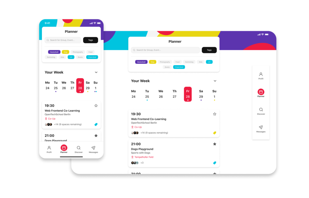
The Planner
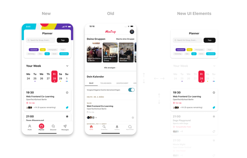
The old interface (home screen) prominently placed the feature “your groups” on top. We are relocating that to a central new location, the Profile feature. The new focus is on planning and structuring your own week or month. It includes the well-known search function (a quick search for events, groups, people, times, etc) and the new tagging feature. Tags allow users to individually select different groups and events so that they can then be quickly filtered in any possible constellation.
In addition to the tags, the new calendar view comes into play. With its horizontal layout, specific days can now be clicked directly. You are no longer forced to scroll down a list to get to a particular event as each tagged event is already shown with small dots indicators at the top of the calendar.
Furthermore, the individual events are sorted chronologically as cards so that the scroll function is retained. If you arrive at the end of a day, the day indicator on the calendar automatically jumps forward or back a day, and the user simply scrolls on. So you have both worlds, the direct navigation of the calendar with events indicators at the top and the scroll interface at the cards shown below.
Discovery
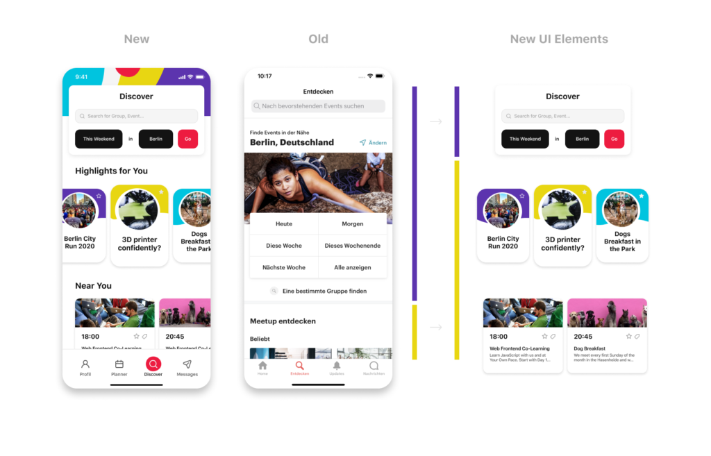
We inverted the proportion between search interface (Purple in the concept presentation) and the proposed events (yellow in the concept presentation, see above). On the one hand, we gain more space for the presentation of promoted events and interesting groups, and at the same time, the new search interface becomes more compact and easier to use. Location and time are no longer spatially separated but appear in chronological order.
You first decide the time period (this weekend, the entire next week, exact date, etc.) and then the location (for example, city, by district or street). The new flow is easier to understand even if it takes a click more. Of course, the search function remains prominently at the top of the screen, but the previously separated interfaces (general search and search for groups) are combined. The search for specific groups retained as a feature and is shown in the new combined search window as a text description.
Responsive
Mobile internet access has long been part of everyday life in 2020. 83% of users want to continue their well-known web-based processes seamlessly on mobile devices too. Responsive design will ensure the same user experience on all possible devices. The current browser experience differs enormously from the app.
With our redesign and the proposed design system, we guarantee smooth operation on all devices and not only improve the usability but also the brand experience in general.
The Result
Our redesign was based on analysis of the app structure and the app store reviews analysis. We have added a few new features to the already good user experience. The restructuring and clearer differentiation of the individual features will also simplify use. We are also confident that the entire rebranding and cross-device concept will further improve usability.
Just like with any other guide, tips specified are just a place to get started. Make sure to match them with your own ideas for the best results. Our UX / UI design experts at Customlytics are happy to support you in any way to audit and advise on your mobile UI/UX design. If you want to know more about our work check out our ASO case study together with COUP and CodeCheck or drop us a note at [email protected].