
Author: Adam Napoli
– Senior Graphic Designer
Introduction
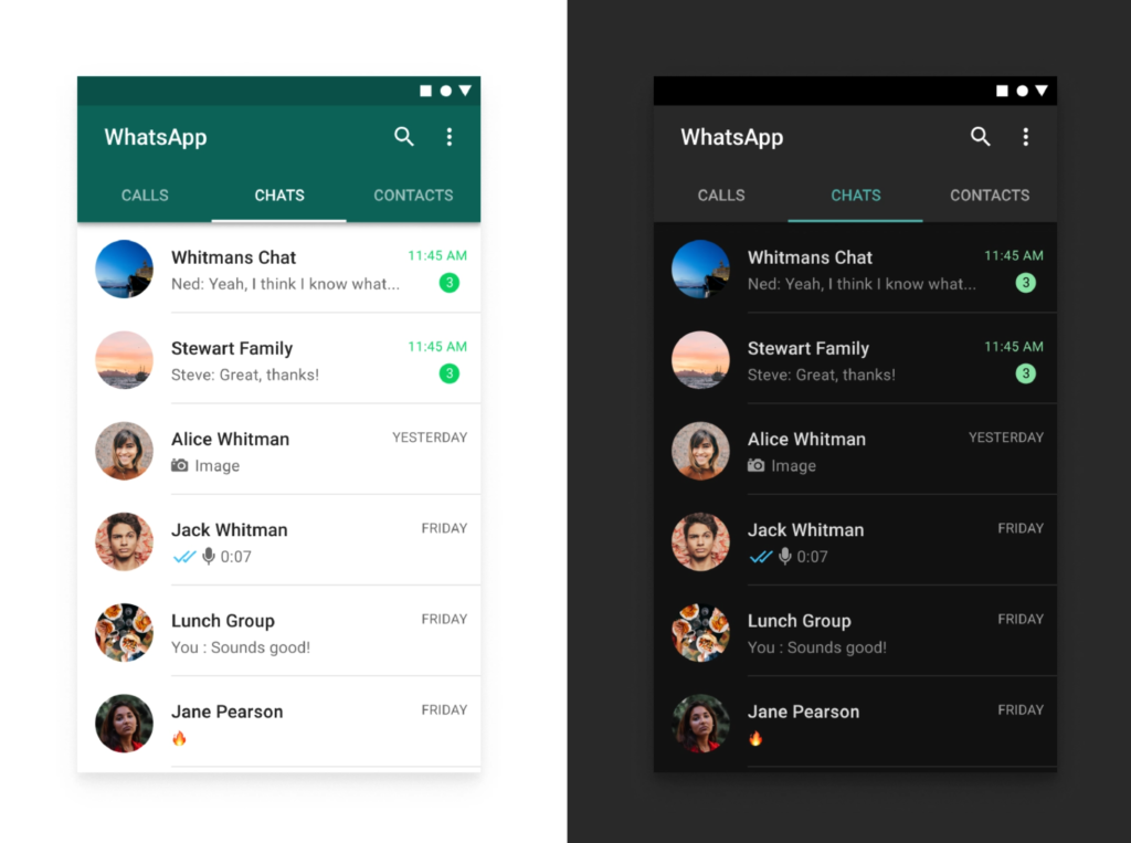
Stylish. Modern. Cool. These are some of the words you would hear from any designer’s mouth when discussing the topic of why they prefer to use Dark Mode on any mobile or screen device. Since iOS 13.0, Apple has introduced Dark Mode as an option for users to change their default interface style to a mode with a darker color palette for all screens, menus and controls. Google has also followed suit by offering Dark Theme since Android 10. Many of the big players in the app industry (WhatsApp, Instagram, Gmail, for example) have created a dark mode to cater to users who prefer this display setting. Smaller apps intending to contend with the dominant apps on the market should look to keep up with innovative changes that provide value for their users, so researching and understanding the value of a Dark Mode setting should be essential for all app developers.
So what’s all the fuss about? Why is everybody taking the time to develop an alternative version of their app? Let’s dive into it.
Not just a sleek surface
One may think that dark mode is simply an inverting of the current colors and styling on a display screen. But there’s a lot more to it. Designing a dark mode setting allows the designer the opportunity to highlight visual cues through the use of contrast and depth, shining a spotlight on important app content and not the frame around it.
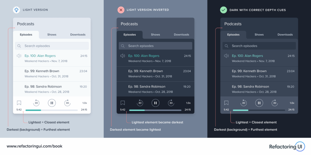
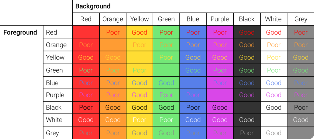
While many colors contrast well with a ‘light theme’ display, there are actually more primary and secondary colors that work against a dark display. For example, yellow text is nearly impossible to read on a white background. Against a darker background, such as black or grey, the yellow text pops. The same goes for certain hues of green, blue and pink. The ability to emphasize these colors via a dark interface provides more versatility, accessibility, and options for consistent branding and variety.
The following graph is a visual example showing how primary and secondary colors work better against dark and light backgrounds:
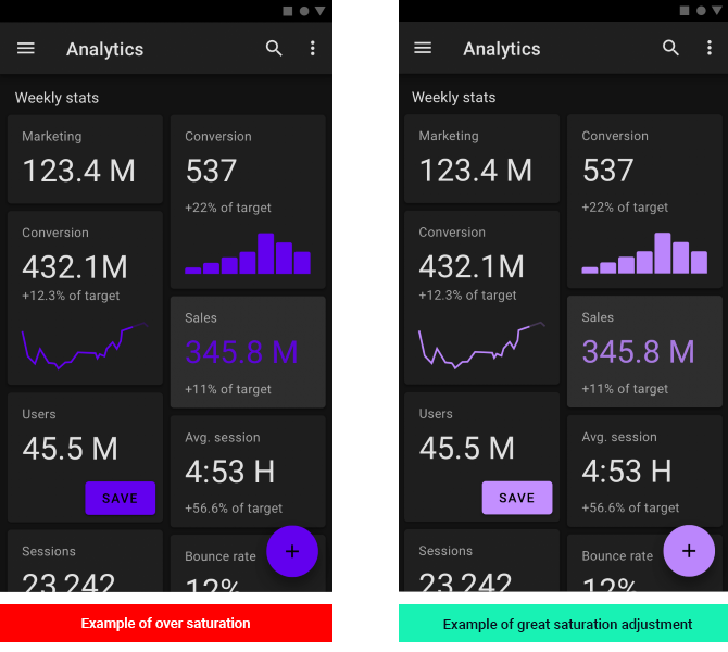
An important aspect to consider when working with bright colors in dark mode is contrast. An element that is bright purple might stand out when placed on a dark background, but if the purple is too highly saturated, the vibrancy might be too harsh for users. In this instance, the bright purple works better with a white background. But by desaturating the color slightly, you will be able to maintain appropriate contrast, elevate the content, and also make the content legible without causing any eye strain.
Health benefits of a darker display setting
Most humans use mobile devices for several hours a day, morning and night. According to a Nielsen research group in 2018, humans spend more than 11 hours per day on our devices. This intense screen usage can lead to dry eyes, insomnia and headaches.
While dark text on a light background is best for legibility purposes, light text on a dark background helps reduce eye-strain in low-light conditions. While we use our phones predominantly during the day, there are always situations and settings where enabling Dark Mode will assist in reducing the strain on our eyes and improve the general legibility of a screen display.
Having the option of Dark Mode appeals to a segmented audience who may choose one app over the other due to the convenience and accessibility of the display options, especially those with vision impairment or general eye strain due to over usage.
Improved battery
Apps with a Dark Mode setting can prolong your smart phone’s battery life. According to Google, using dark mode on OLED screens does assist with battery life. At 50% brightness, enabling dark mode in the Youtube app saves about 15% screen energy. At full brightness, the dark interface saves 60% of screen energy (in comparison to using light mode). Android devices use OLED screens and recently, Apple has used OLED screens (previously LCD screens) since the release of the iPhone X. Phonebuff recently conducted a battery life test.
Check out this video for the results:
https://youtu.be/qbxdHpD5jWw
App marketers are creating wonderful and diverse mobile experiences for users that count on them having the ability to use their mobile devices for prolonged periods of time. For example, if a user is midway through the purchase funnel that will provide the app with revenue, and the battery dies due to general usage throughout the day, the conversion is lost and the user may not return. Battery is a big part of user experience and should always be considered during the app development process.
Summary
The rise of Dark Mode is no chance event. As our device usage increases, so does the need for adjustments and innovations to improve how we utilise modern technology without hindering our ability to do so in the long term. Change is inevitable, and the major players in the mobile game have begun to set the standard for user optimization through big changes such as dark mode. In order to compete with this standard, smaller players need to consider the importance of developing alternative display settings and use whatever necessary means to reach a wider target audience and deliver a valuable experience to your users. While the benefits of improved battery, better health for users and a cool aesthetic may not be enough to sway a large portion of mobile app users, we cannot discount its impact on user experience for several audiences.
Looking for UX/UI mobile app advice? Our experts at Customlytics are ready to help you optimize your app to maximize its growth and potential. Get in touch with us at [email protected] and let’s get to work!