With Apple’s introduction of A/B testing and in-app events to the App Store, the improvements to the App Store will have some enticing results for developers.
As the App Store has grown, it’s become harder for app developers to market their apps to new users or get their apps found. However, the new features aim to help with that.
Developers will be able to better target their apps to users, get their apps discovered by more people and even highlight what sort of events are taking place inside their apps to entice new users to download the app and encourage existing users to return. While preserving the default Product Page as a control, they are reflecting real user decisions at the same time. This will help developers obtain actionable metrics and make data driven decisions with comparative ease and issue a more accurate view of the impact changes make on conversion. These new features will both be available directly on the iOS App Store through App Store Connect, replacing the role of many third-party testing platforms.
With a steady growth, 600 million weekly users across 175 countries, Apple has paid out more than $230 billion to developers since the App Store launched, highlighting the business opportunity for app developers.
Since May of 2015, A/B testing has been available on the Google Play Store through Google Play Experiments, while developers on the iOS App Store had to rely on conversion optimization via Apple Search Ads creative sets, using third-party testing, or placing new builds to compare metrics before and after the change.
However, these methods of testing have always come with limitations. Unlike Google Play Experiments, testing using Apple Search Ads or a resource outside of the App Store can give some insight, but only give metrics for a subset of paid traffic to use as a proxy before moving.
Product Page Optimization
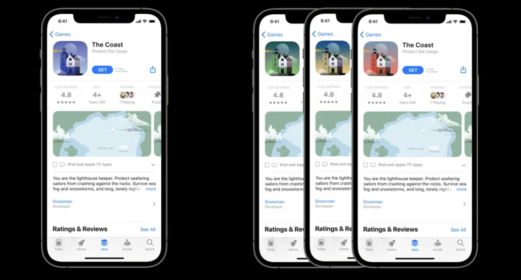
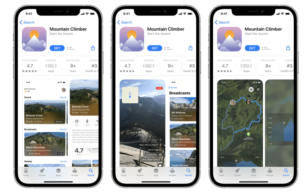
One change involves the app’s product page. App developers will be able to create multiple custom product pages to showcase different features of their app for different users. They can employ a variety of treatments to creative assets: the app icon, screenshots, and preview videos to A/B test what users like the most and to determine which change most drives conversion.
To limit the number of assets changed to one per test cycle will help eliminate variables, making it easier to isolate which singular variation is most successful in improving conversion rate. Each individual test can run up to 90 days, and both during the cycle and upon conclusion the results can be monitored and compared to baseline performance in App Analytics.
Avoid A/B testing several elements & changes at once
It can be easy to fall into a trap of testing too many elements at the same time. This will make it difficult to identify what elements are successful in which test and how to adapt these results in order to achieve the highest possible conversion rate.
Simple changes can be made in order to achieve quicker and accurate results. For example, one test can involve changing the background color across all screenshots. Another could be the images inside a phone screen. You could also try changing the App Icon with different brand colours or variations of the logo. More experimentation can occur in the future with text changes, and even changing which screens/content should appear first. These should all be done one at a time, for a long period of time, to find out exactly what elements users respond to, and slowly evolve the design.
When you can gain insights into consumer behaviour and learn about what they respond to, knowing how to engage with them in the future will prove much easier.


In-App Events
At WWDC 2021 Apple explained that apps and games are continually rolling out new content and limited time events like film premieres on streaming services, events like Pokémon GO fests, or Nike fitness challenges. A lot of marketers were worried about in-app events only being discoverable by those who already had the app installed and then opted in to push notifications. Now, developers will also be able to advertise the dynamic things that are taking place inside their apps on an ongoing basis.
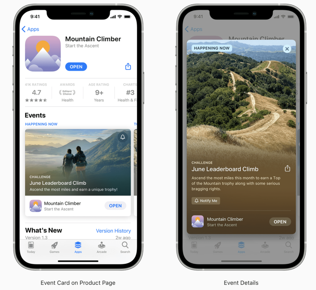
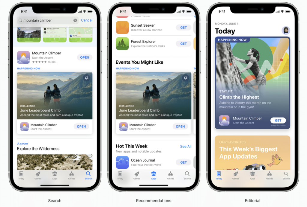
With the launch of in-app events, Apple will now allow developers to better advertise these events “front and center on the App Store.” Users can discover events with personalized recommendations and through App Store search. The events can be showcased on the app’s product page. They can learn more about the events, sign up to be notified or quickly join the event, if it’s happening now.

The new App Store widget will feature upcoming events right on users’ home screens, based on what App Store editors will curate as the best events. Apple says the feature will be open to all developers, including those who already run events and those who are just getting started.

Custom Product Pages
Depending on the targeted demographic, the optimal page can vary fiercely. Taking a one-size fits-all approach to page design and marketing creates missed opportunities to capture additional audiences and refine messaging for existing ones. Custom Product Pages fit in nicely as a sophisticated solution for reaching every user in a way that appeals to them. Custom Product Pages have a cutting edge for running testing, particularly with paid traffic from sources outside of the App Store. A developer can create a unique campaign for various platform traffics.
For example, let’s say a podcast app simultaneously ran ads on a news app, a social media page for true crime enthusiasts. With Custom Product Pages, the first ad could link to a page positioned for the app’s news podcast features, the second to a page highlighting true crime podcasts and audiobooks. The possibilities for expanding an app’s audience are almost endless by employing a clever ASO strategy designed to optimize the up to 35 different custom pages available.
Want to know more about ASO challenges for mobile marketers in 2021? Head over to our blog article “Webinar Recap: How to Master ASO in 2021” for more information.

Design Variations
We have compiled a short list of elements and variations to be considered for A/B testing:
- Colors – an easy one. Many elements can use color adjustments for testing. Backgrounds, text elements, phones to name a few.
- Text – size, weight, style. Make sure you stick to brand guidelines.
- Images – some designs rely on imagery to present their app narrative. If the imagery is available, always try and find content that suits the app and your narrative.
- Phones – a common element used for screenshots. You should always be using the latest phone models in your design, but you can also change the phone color itself for testing.
- Messaging – changing your USPs can help keep the content fresh and users interested. Too much change however, can be a detriment and cause confusion for users. Keep messaging consistent and make small changes only.
- Screenshot order – changing which content you show earlier is important as users typically drop off before reaching the final screenshot in your set. According to research by storemaven, only 6.5% of users will reach the 5th screenshot, and less than 1% of users will watch the 10th screenshot. However, almost 85% of users will view your first screenshot.
- Seasonal variations – adjusting your creatives for holidays, seasons and other events should always be considered for App Store Optimization. Stay on top of your competitors by using relevant marketing design to help boost your conversion rate by reminding users of what they may need for a specific time of the year.
Custom Product Pages also offer a way to test your creatives impact on conversion across these different avenues. Available in App Analytics, developers can view actionable performance data on impressions, downloads, conversion rate, retention, and average proceeds. This will provide insight into which product pages are driving conversion for specific demographics, and allow developers to refine their assets to increase overall conversion across their paid channels.

With the ability to create up to 35 Custom Product Pages, this concept can be expanded further to create multiple custom pages for different subsets of each traffic source, matching the messaging and creative on each one to a custom link. This will allow developers to create cohesive messaging across every step of the acquisition funnel from external channels, run conversion tests and see what performs best.
Mobile A/B testing is a continuous process
Testing can often be a time-consuming process, one that requires patience, creativity and an analytical approach. Discovering what users respond to and want to listen, see or watch is essential in allowing your product to reach a wide audience, and will also provide you critical insights for other marketing strategies that should then be developed in the future.
From now on, directly from the App Store Connect, developers will have powerful tools to get actionable conversion data and tweak external marketing campaigns. While these new features will completely transform A/B testing on iOS, it is important to be prepared for a regularly changing process. Critical to being prepared for the changing testing landscape of the App Store is the continued testing with previously available procedures as part of a solid App Store Optimization strategy.
We make sure that your ASO and brand go hand in hand! If you need help with your ASO challenges, reach out to us via [email protected]. Our mobile experts have many years of experience with A/B Testing and ASO and can help you to automate your business.
💡 Knowledge sharing is at the core of what we do. Learn more about the app industry and discover useful resources by signing up for our newsletter or by bookmarking the Customlytics App Marketing blog in English.
📚 We love useful stuff. That’s why we co-wrote the Mobile Developer’s Guide to the Galaxy. Get your free paperback copy or download the eBook here providing you with all the mobile knowledge you need.
💜 Become part of our community on LinkedIn, Twitter, Glassdoor or Medium.


