
Author: Adam Napoli
– Senior Graphic Designer
“Want your users to fall in love with your designs? Fall in love with your users..” – Dana Chisnell
In our new blog series The UI/UX Makeover, we select popular German mobile apps bearing the potential to provide their users with a better experience. A micro-makeover within 8 working hours for applications from all sorts of verticals. The first article looked at the HRS mobile app. Today Customlytics’ graphic design experts challenge the WhatsApp messenger app and will apply a micro facelift to the app’s UI/UX design.
Our graphic design team here at Customlytics accepts that challenge every day. And we will share with you a sneak peek of how to aim for the perfect balance between having a clean UI for mobile apps while displaying valuable information to the user.Let’s get started and if you want us to tackle the design of a specific mobile app, reach out to us.
The Situation
For the next Customlytics UI/UX makeover, we review one of the biggest global messaging mobile apps: WhatsApp. Acquired by Facebook in 2014, WhatsApp is a free, cross-platform messaging service that allows users to send text messages, voice recordings, make video calls and share images, files, location and more. With over 1.5 billion users worldwide, it is the primary means of communication in several countries, including most of Europe. Users have the option to text message, make audio calls and video calls. For this micro makeover, we are focusing on the messaging system (called Chats).
Though it provides the standard requirements of a messaging service app, we will be looking in-depth at the current UI/UX design and see how we can make improvements.
We found the pain point…The Chats menu doesn’t have an effective interface allowing for a faster messaging filter system. In an ideal case, the user would be able to quickly distinguish chats that are unread or from groups, saving time from scrolling through potentially long lists of previous conversations.
The Problem
In a high-paced modern society, time management and efficiency are key to most users. Daily mobile phone activity is dominated by messaging above all else, so streamlining the way we effectively communicate with people we want to be communicating with is essential.
When opening the WhatsApp mobile app you are directed to whichever section you had last used on the app (in this and most cases, the Chats section). In the Chats section, all conversations are stacked on top of each other in chronological order, (common amongst most messaging apps) making it difficult to find unread messages if they are further down the chat pile. There is also the issue of finding certain conversations as it can be difficult to distinguish individual chats and group conversations.
Furthermore, often the user finds oneself in group conversations without ever asking to be in it, with no invite or approval system in place to stop unwanted conversations being added to the inbox.
The Solution
We want to prioritize certain aspects of the interface to streamline the user experience without creating too many additional clicks that take time away from the user. We also want to highlight essential elements to the interface that allow for a more legible and user-friendly design.
One element raising questions is the Broadcast Lists option highlighted in blue. With the Broadcast List feature, you can send a message to several of your contacts at once. Broadcast Lists are saved lists of message recipients that you can repeatedly send broadcast messages to, without having to select them each time. I sent out a quick survey asking WhatsApp users if they had ever used this option to send a message. 8 out of 59 users responded saying they use this option. That means 86.5% of those who answered this survey voted for the response I Never Use It.
In order to add to the interface that will allow the user to organize individual chats/groups/unread messages, we need to make sure we have space for these filtering options, but to also make sure we don’t remove too many conversations from the display by including these options. Removing the Broadcast Lists option will allow for a clean slate under the heading and we will be able to include our new options.
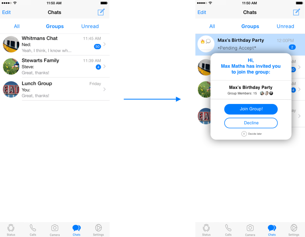
We also want to create an easier option to join or be a part of group chats rather than be automatically entered into a conversation and then having to reluctantly leave the group, which other members of the group can see clearly. This can be solved by an invite system that pops up when receiving an ‘invitation’ to join a group chat. The user would be able to accept, decline or decide later. Only accepted invitations to the group would let the user be a part of the conversation and read any messages in the chat.
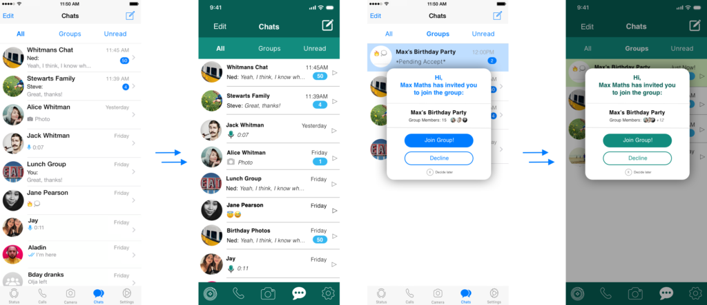
Here are the adjustments we’ve made to change the Chats section for the app:
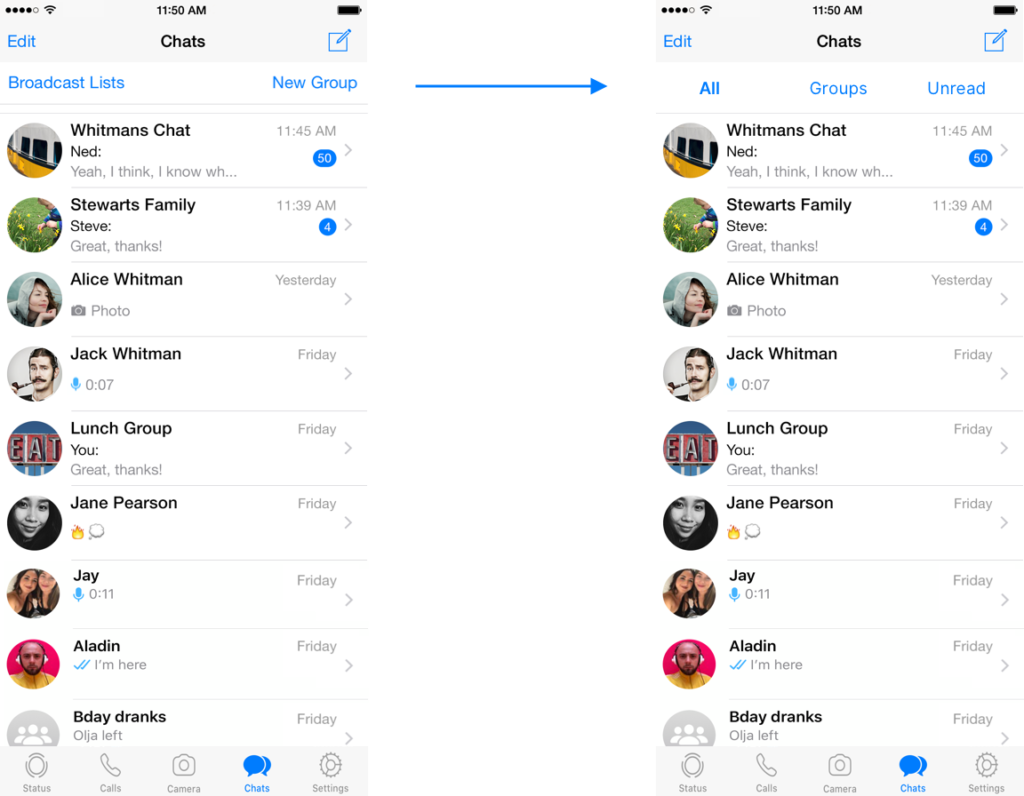
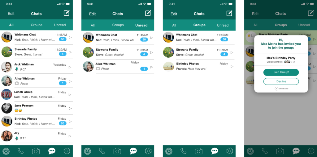
1. Change the interface to allow for filtering conversations- now allowing the user to quickly choose from all conversations, group, and unread messages. The unused Broadcast Lists option has been removed to make space for this option.
2. Customize group chat options – a pop up appears when receiving an invitation to a new group chat, which can then be accepted, declined or left pending. The pop up shows you the name of the thread and how many members are in it. The pending chat is highlighted in blue to distinguish itself from the active group chats the user is a part of. If the user declines, the chat thread will disappear from the screen.
3. Design overhaul – we’ve also given the look of the app a bit of a facelift. We are using an iOS operating system in this example, as the app differs in appearance on iOS and Android devices. One major factor for the difference in apps is that users of a particular platform get used to using apps a certain way and expect all the apps on that platform to have a certain degree of similarity in usage, so it’s easy to use, intuitive for the users. So in our style changes, we have kept the exact interface, but have added WhatsApp brand colors, updated icons and changed the font styles slightly to enhance legibility for the text. This design overhaul is an additional element to the makeover.
The Result
The UX/UI changes we have proposed for WhatsApp have been developed within reason of the app’s potential capabilities, which makes the proposed new UX/UI changes completely within the realm of possibility. Focusing on the most prominently used aspect of the app, in this case; the messaging system is a smart and effective way to increase user satisfaction and ensure user growth in a competitive industry.
Just like with any other guide, tips specified are just a place to get started. Make sure to match them with your own ideas for the best results. Our UX / UI design experts at Customlytics are happy to support you in any way to audit and advise on your mobile UI/UX design. If you want to know more about our work check out our ASO case study together with COUP or drop us a note at [email protected].