

Author: Adam Napoli
– Senior Graphic Designer
“People ignore design that ignores people.” – Frank Chimero
In our new blog series The UI/UX Makeover, we select popular German mobile apps bearing the potential to provide their users with a better experience (see previous makeover’s for WhatsApp & HRS). A micro-makeover within 8 working hours for applications from all sorts of verticals. Today Customlytic’s graphic design experts challenge the MediaMarkt shopping app for Android and will apply a micro facelift to the app’s UI/UX design.
The Situation
For the next Customlytics UI/UX makeover, we review the mobile app of one of the biggest shopping companies in Germany, Media Markt. Founded in 1979, the company has grown into Europe’s largest retailer of consumer electronics and is known for its red, vibrant, attention-grabbing branding and advertising.
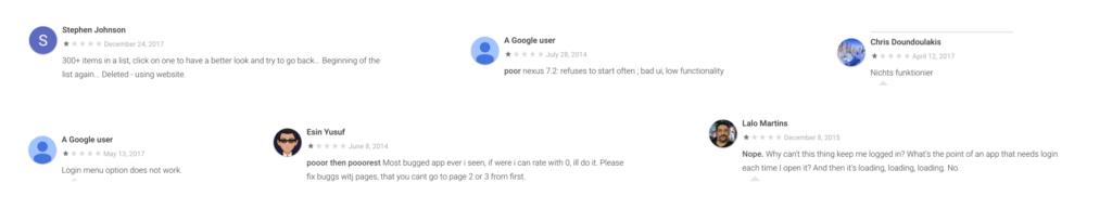
Media Markt released a mobile app in 2013, but it struggled with middling reviews from consumers complaining of poor UI and general functionality. Since those early years, reviews [1] indicate that the app has improved its usability and performance, though some consumers still struggle with loading times, crashing of the app, the user journey and a general lack of features.
After a comprehensive review of the app’s functionality and appearance on an Android phone, we have noticed several issues with the UI and UX.
We found the pain point…
The app interface lacks a wishlist feature that several high profile e-commerce apps use (eg. ASOS). Adding this feature enhances the user experience by allowing them to quickly add products to their ‘wishlist’ while they continue their shopping experience.
The app also has a poor browsing experience. Not only does the lack of visual excitement impact a user trying to find a product, it’s also a laborious process that could cause the user to close the app.
The Problem
‘According to research conducted by Blue Corona, “46% of people say they would not purchase from a brand again if they had an interruptive mobile experience”. What does it mean? It’s clear that in the world where users spend most of their time on mobile devices, it’s essential for you to make your e-commerce portal mobile-friendly.’ – DesignHill
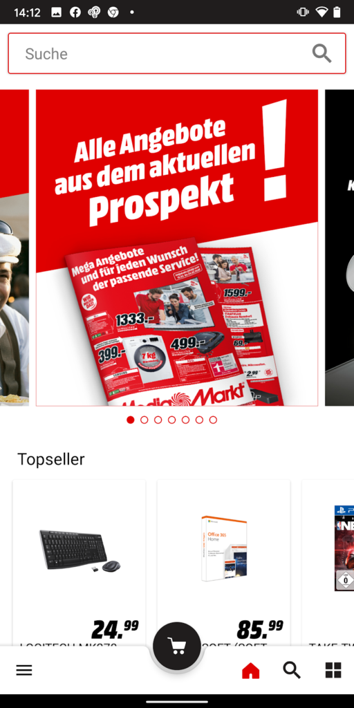
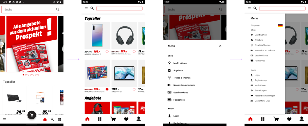
The home screen presents featured imagery that includes a bright red catalog display with copy detailing sales and deals. We also see a single row of product imagery labeled “Topseller”. Beneath that is the menu bar that includes icons for home, search, categories, as well as the ‘hamburger menu’ icon on the left and an emphasized Cart button right in the middle. This menu shows that MediaMarkt is paying attention to how users hold phones and how touch options can influence a display. The current app screen features a search bar at the top of every page and the icon at the bottom. The icon at the bottom is taking up space where another icon could fit, which is where the Wishlist comes in play.
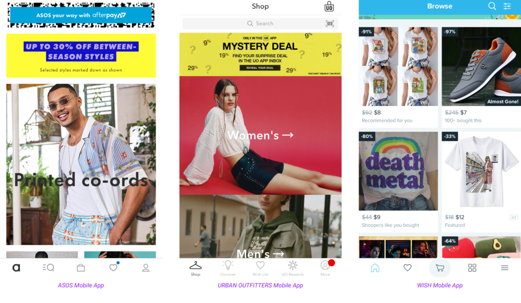
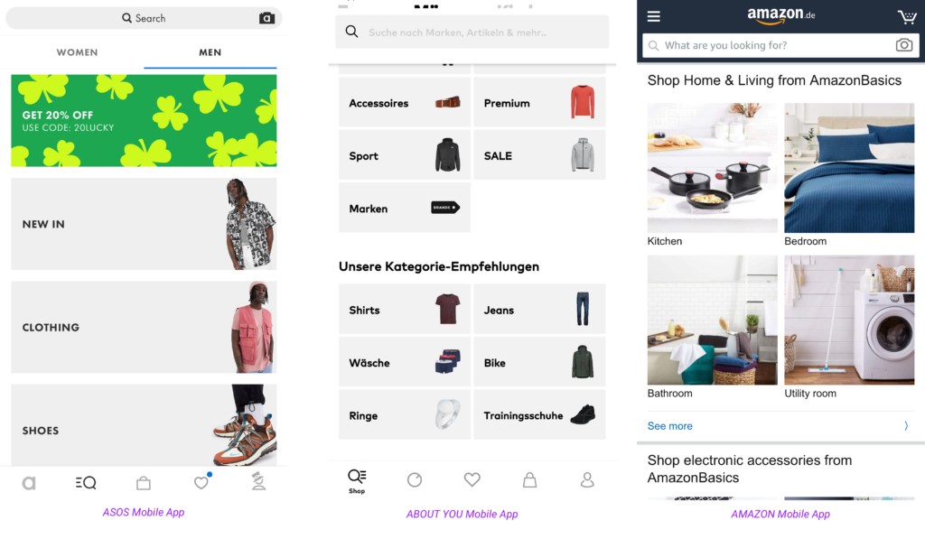
Nearly all of the major shopping apps (ASOS, H&M, Urban Outfitters) utilize a Wishlist function that allows users to favorite products they like seamlessly and then decide later if they want to purchase. It’s a simple function that we could put in the menu section, and also next to every product image. See examples of apps such as these below:
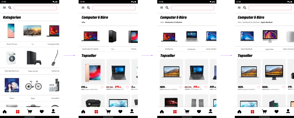
The user journey needs a makeover. None of the product displays on the main screens feature any call to actions. We also need to make a more visually appealing experience that enables the customer to follow a typical Media Markt shopping experience (selecting categories to define what product you need) but also feature other options to improve conversion rates and add to carts. The screenshots below show the current browse-driven user journey to reach the Apple Macbook section.
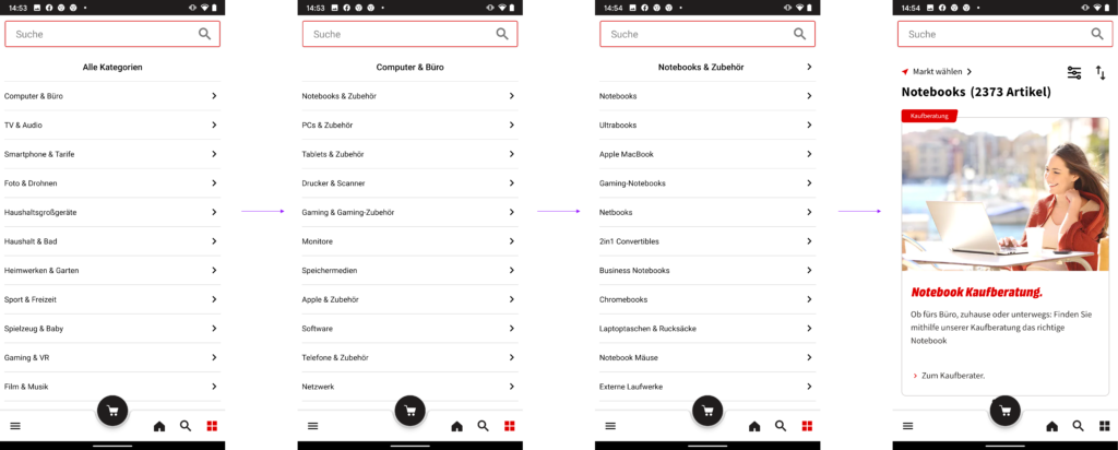
All we see is rows and rows of text with nothing to encourage the user to shop or browse suitable products along the way.
The Solution
We want to add new features to the app that enhance the overall user experience. By creating a new menu bar at the bottom of the screen, we can feature all the options that create a well-rounded user experience.
- Home
- Categories
- Cart
- Wishlist
- Account
… and still have the search bar at the top of every screen. The current app search bar works similarly to Google’s Autocomplete Suggestion feature which automatically suggests products as you type in your search.
According to PrefixBox, a vendor for Commerce Search Engines ‘Autocomplete is an eCommerce search suggestion solution that quickly suggests relevant recommendations to users as soon as they click in the search box. Its primary goal is to find out user intent and provide relevant keyword suggestions so users can easily navigate to the best possible Search Result Page’ and we want to make sure this remains as a prominent feature on every screen.
We need to change the journey for browse-driven users. By offering a more visual experience, we want to motivate the consumer to explore other shopping options and products they possibly hadn’t considered previously due to the current browsing flow of the app.
Refining the product displays by changing the backgrounds and adding the wishlist button will improve the overall visual aesthetic of the app.
Ok, so here are the UX/UI adjustments we have made:
1. Change the interface to include more features – We now can give users the option to add a product straight to their Wishlist (the heart icon). This new feature doesn’t require a lot of screen space, and the button fits in nicely next to the price point. Adding this to the app allows all users to continue their search after saving products they are interested into the Wishlist and motivates browser-driven users to explore even more deals and products.
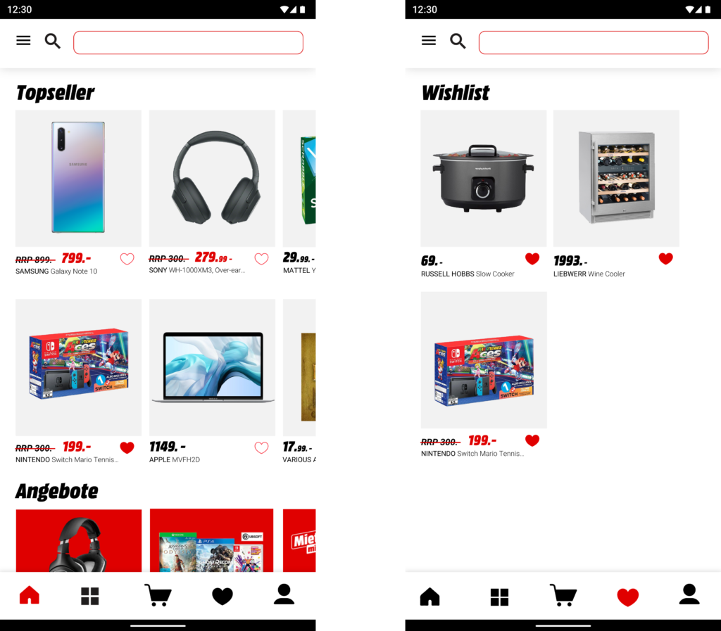
The product image background has been changed to a light grey that is in line with other high profile eCommerce experiences (The Iconic, for example), framing the product to make it more visually appealing. Our cart has remained as the central icon, and we can easily alternate screens by selecting the different menu options. The search bar has remained at the top, as is the hamburger menu to the left.
2. Upgrade the user journey for browse-driven consumers – When users now browse by category, they are greeted with a more interactive experience that still keeps the flow of the current Media Markt customer journey. Below is the new version:
The Result
The UI/UX improvements we have proposed for the MediaMarkt app have been developed based on research, reviews and best UX practices that are currently being utilized by highly successful and well-reviewed shopping apps. Rather than completely change every aspect of the journey, the changes made allow a more interactive experience that is easy to use and more visually interesting.
Just like with any other guide, tips specified are just a place to get started. Make sure to match them with your own ideas for the best results. Our UX / UI design experts at Customlytics are happy to support you in any way to audit and advise on your mobile UI/UX design. If you want to know more about our work check out our ASO case study together with COUP and CodeCheck or drop us a note at [email protected].